Art Direction · Selected Work

Art Direction.

From the first idea to the final frame. These are projects where I shaped the concept, the look and the finished images, with a short note on how each one came together.

Concept development Moodboards & treatments Casting & styling Set & lighting direction Photography Retouching & color

Projects

  1. 01 Keeping Your Inner Child Alive NYU Tisch · Senior Thesis 2025–2026
  2. 02 PRISM.A Concept makeup brand · Class project 2025
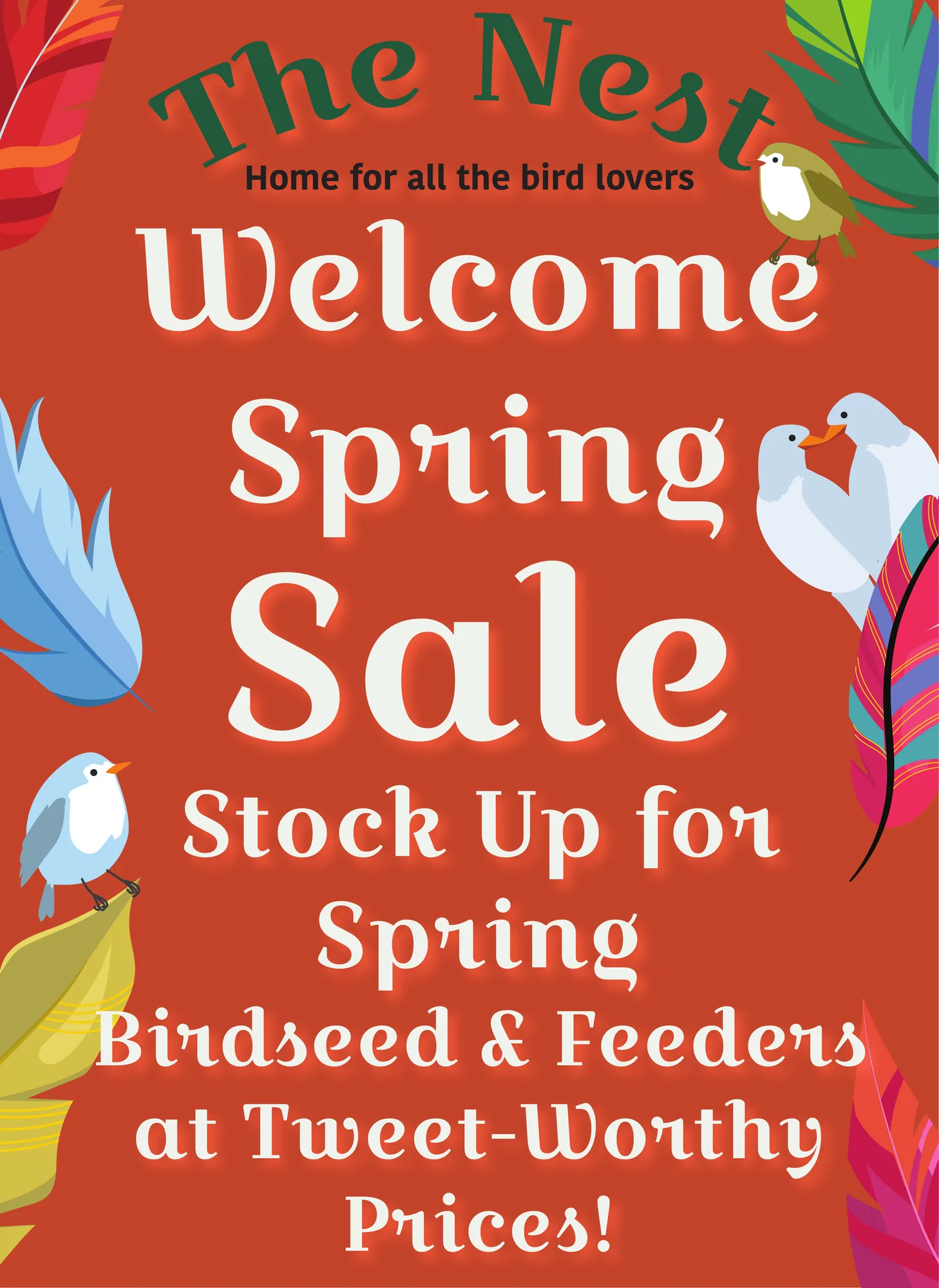
  3. 03 The Nest Bird-watching shop · Lower East Side 2025
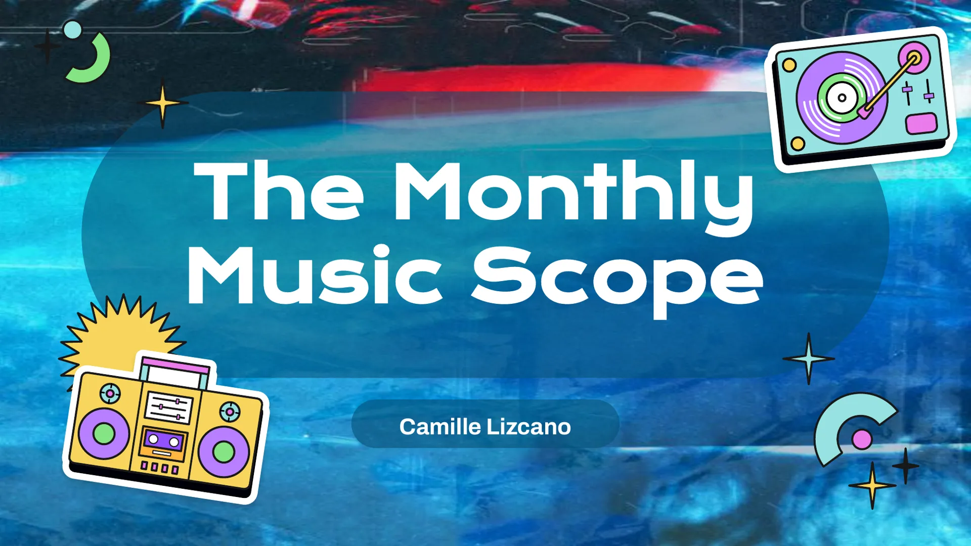
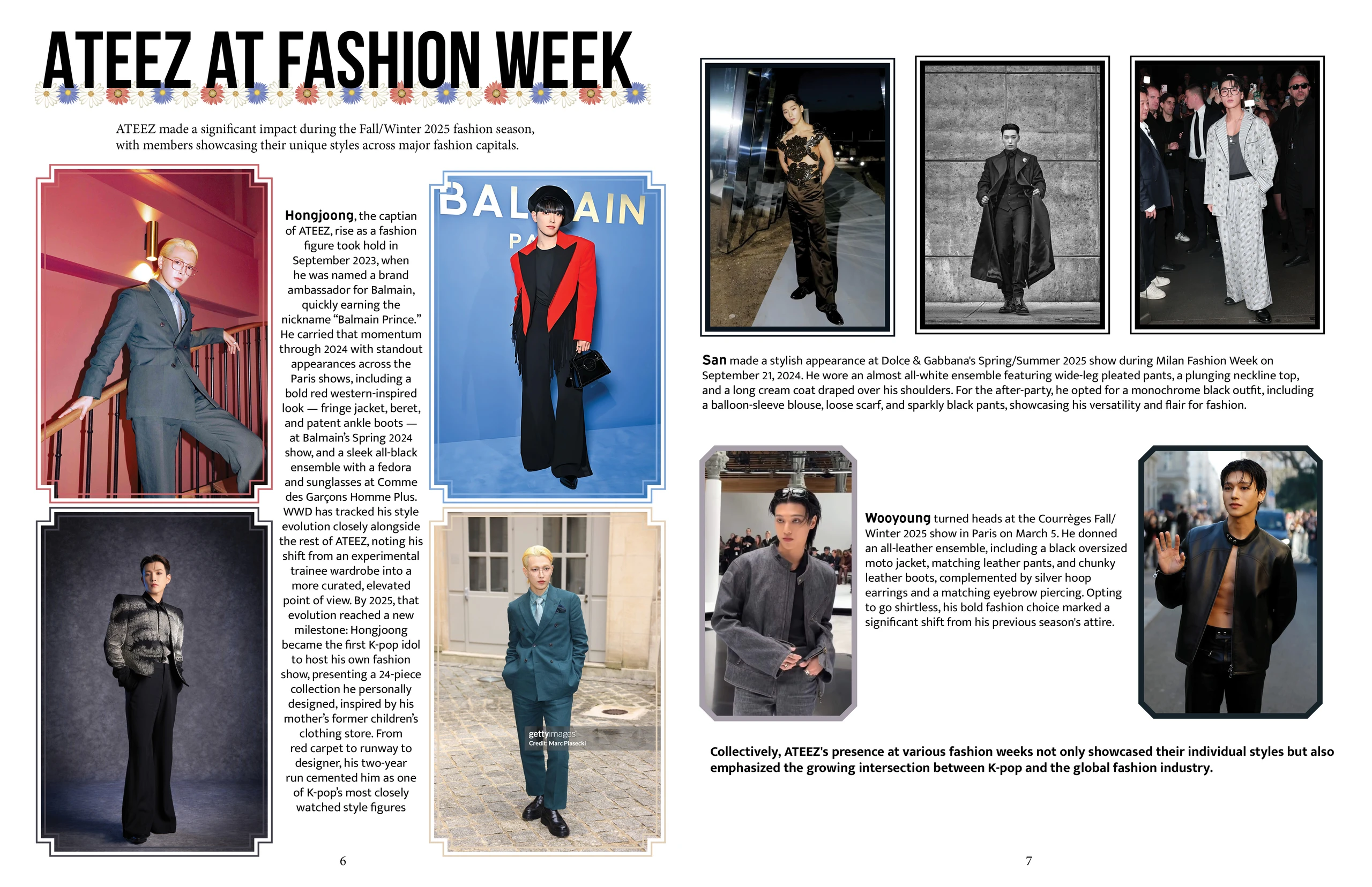
  4. 04 The Monthly Music Scope Concept magazine · Class project 2025
01
NYU Tisch · Senior Thesis · 2025–2026

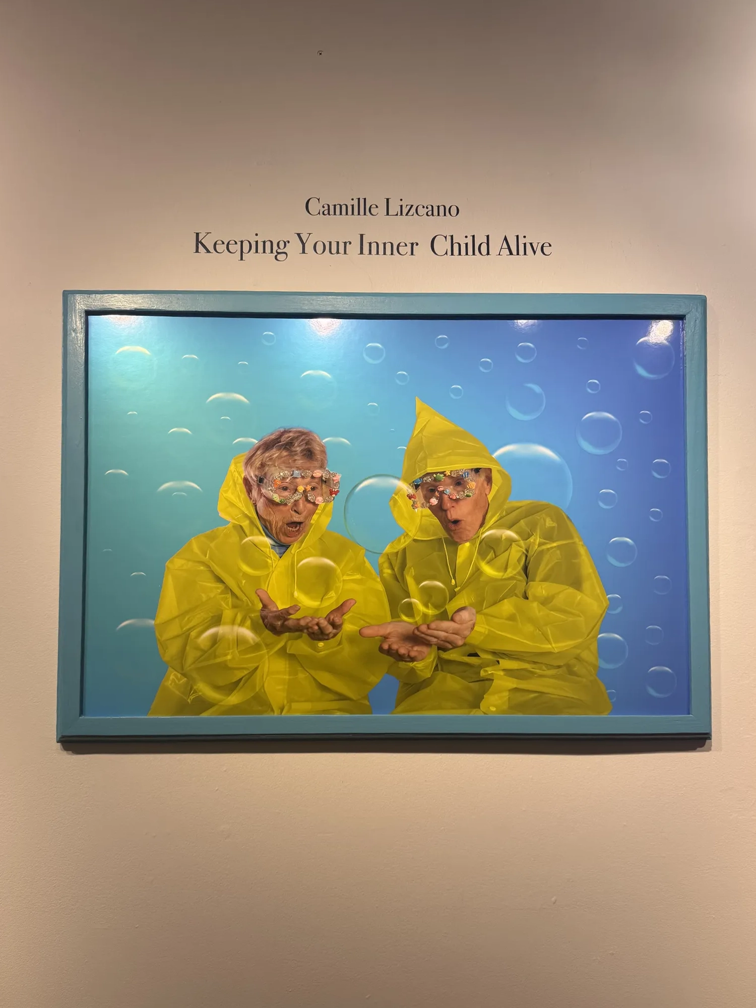
Keeping Your Inner Child Alive

The brief

A five-month senior thesis at NYU Tisch: a visual project exploring nostalgia, play and creativity, carried from first idea all the way to a gallery wall.

The idea

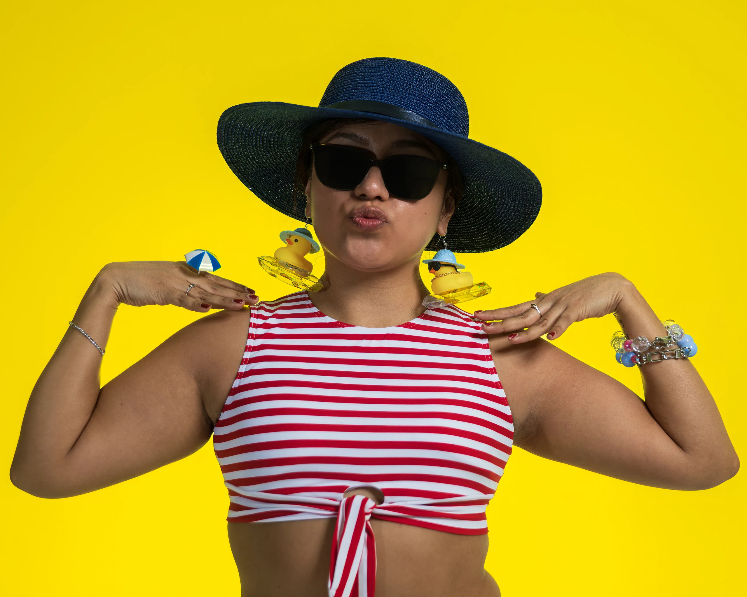
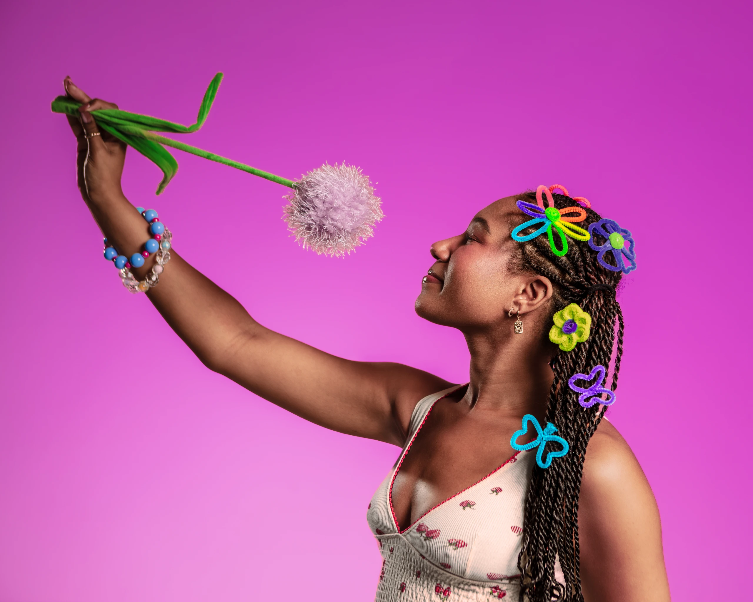
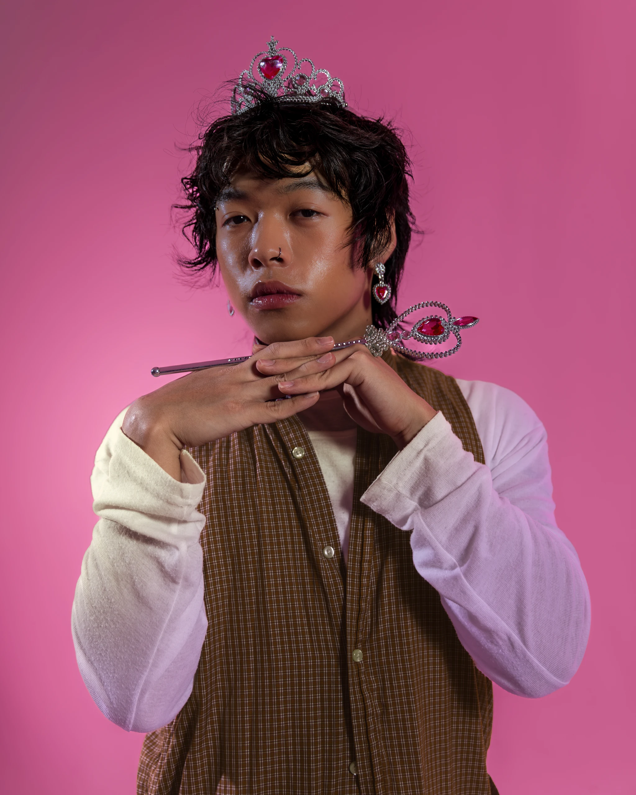
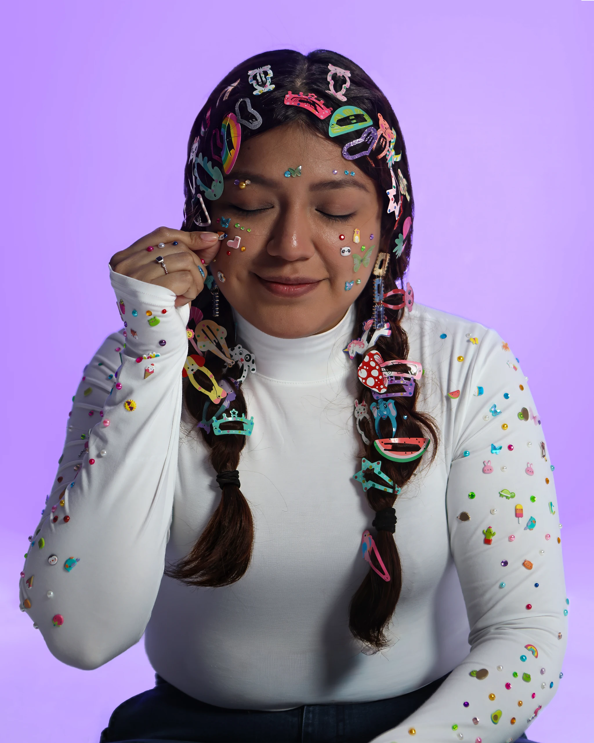
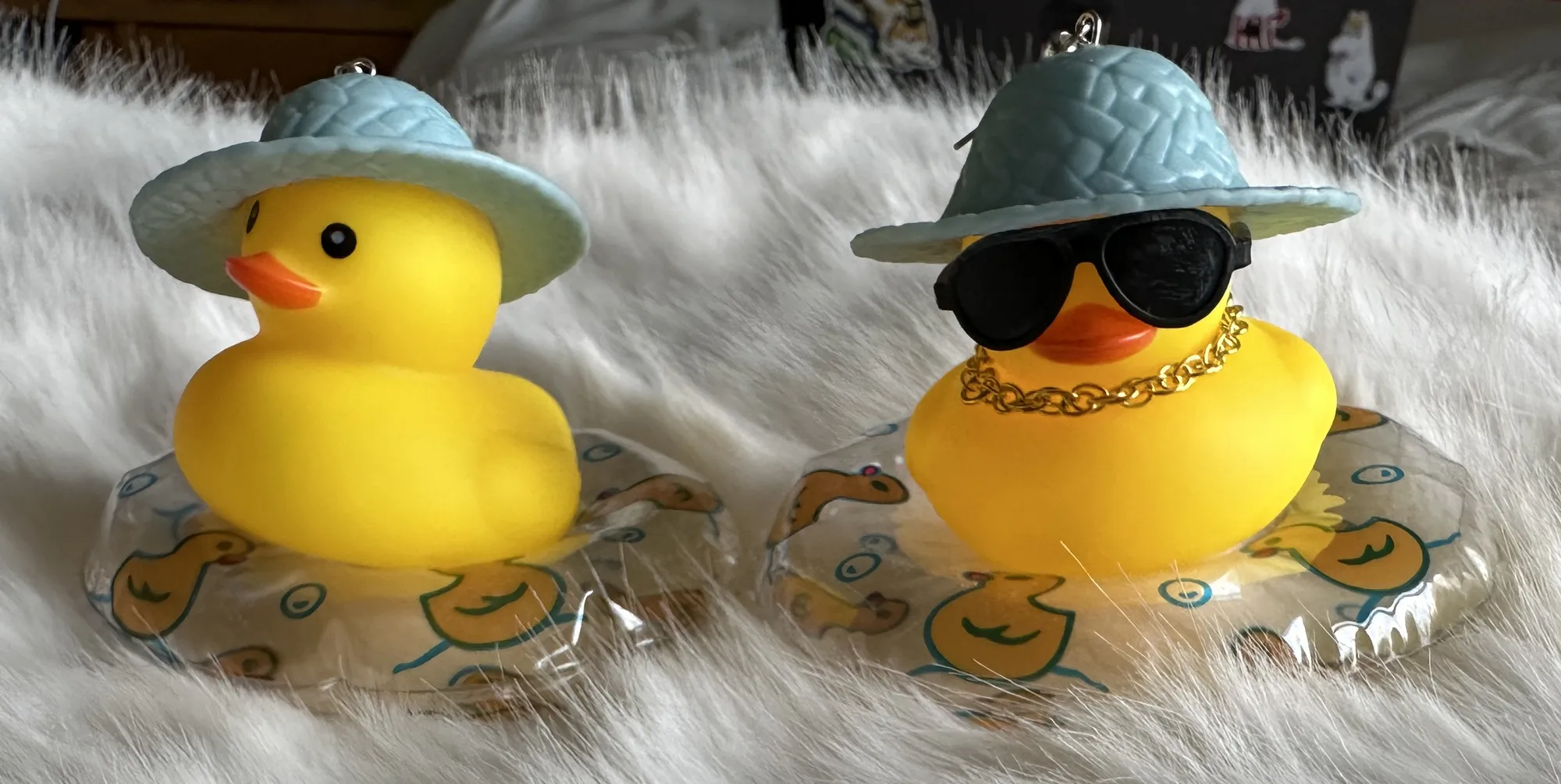
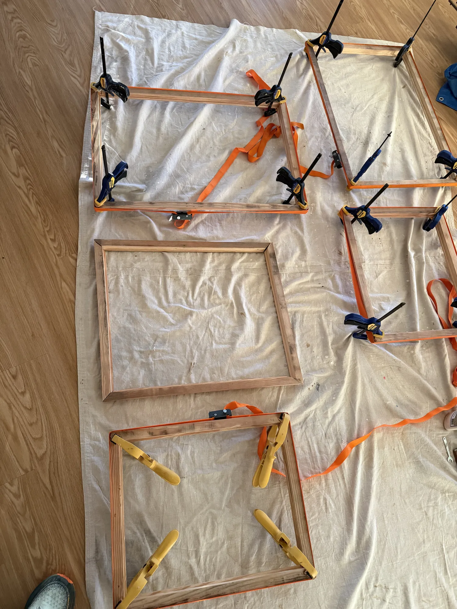
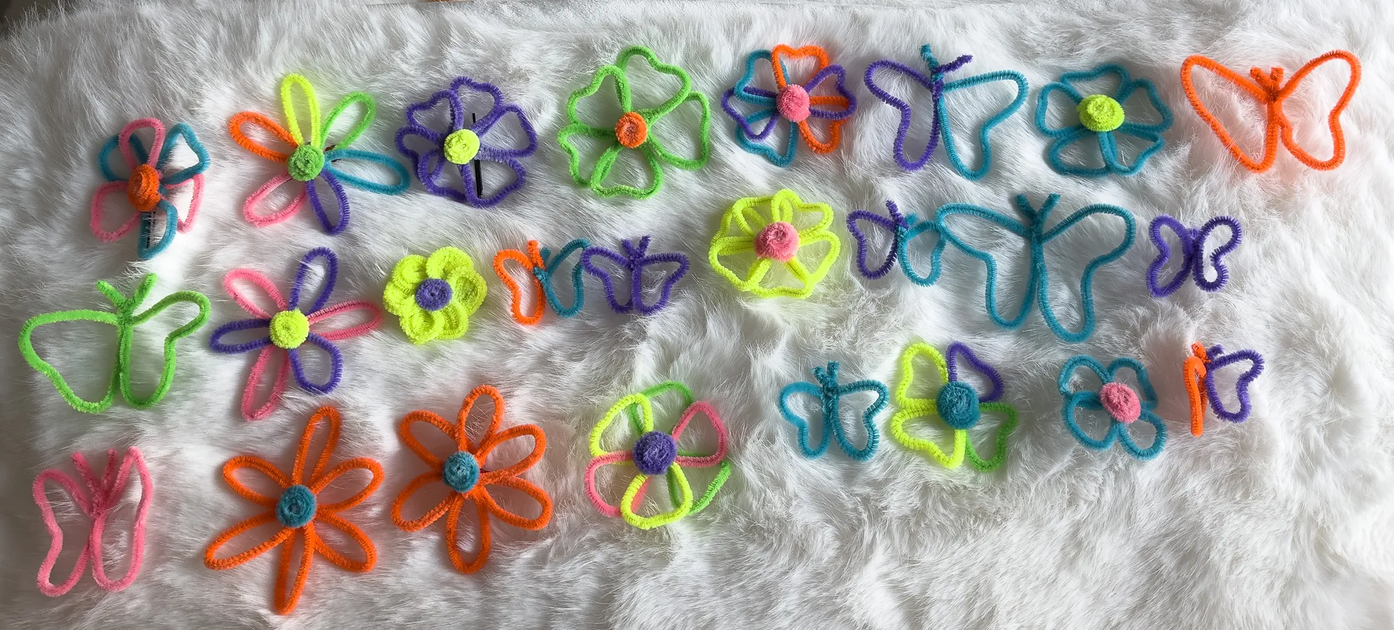
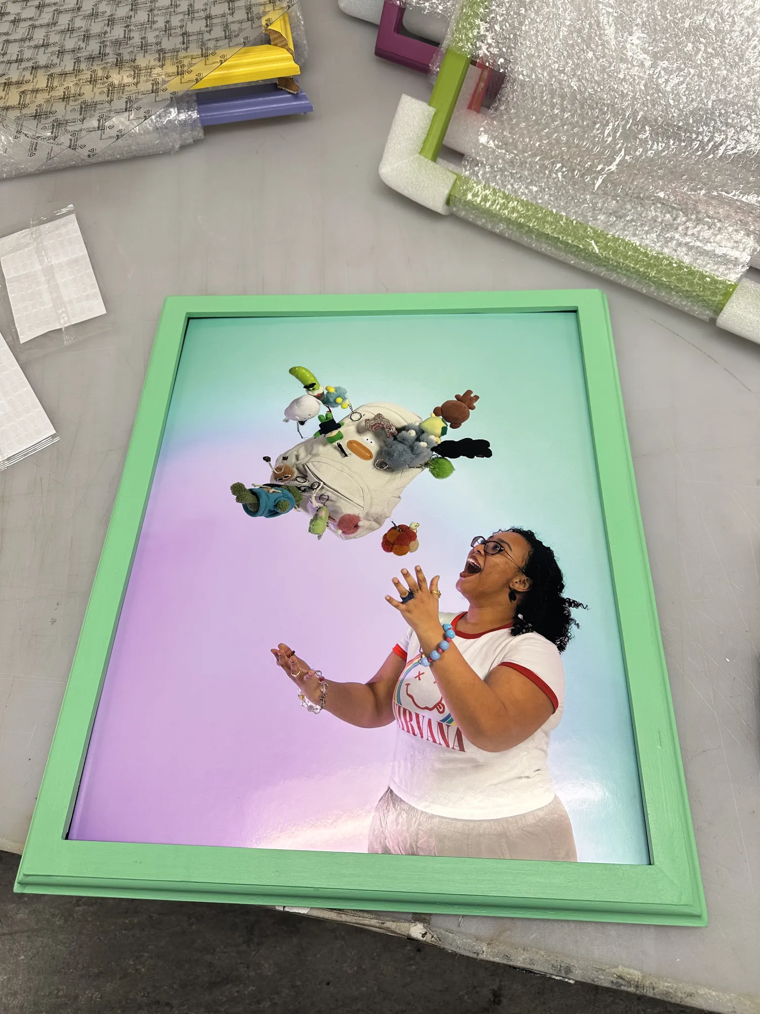
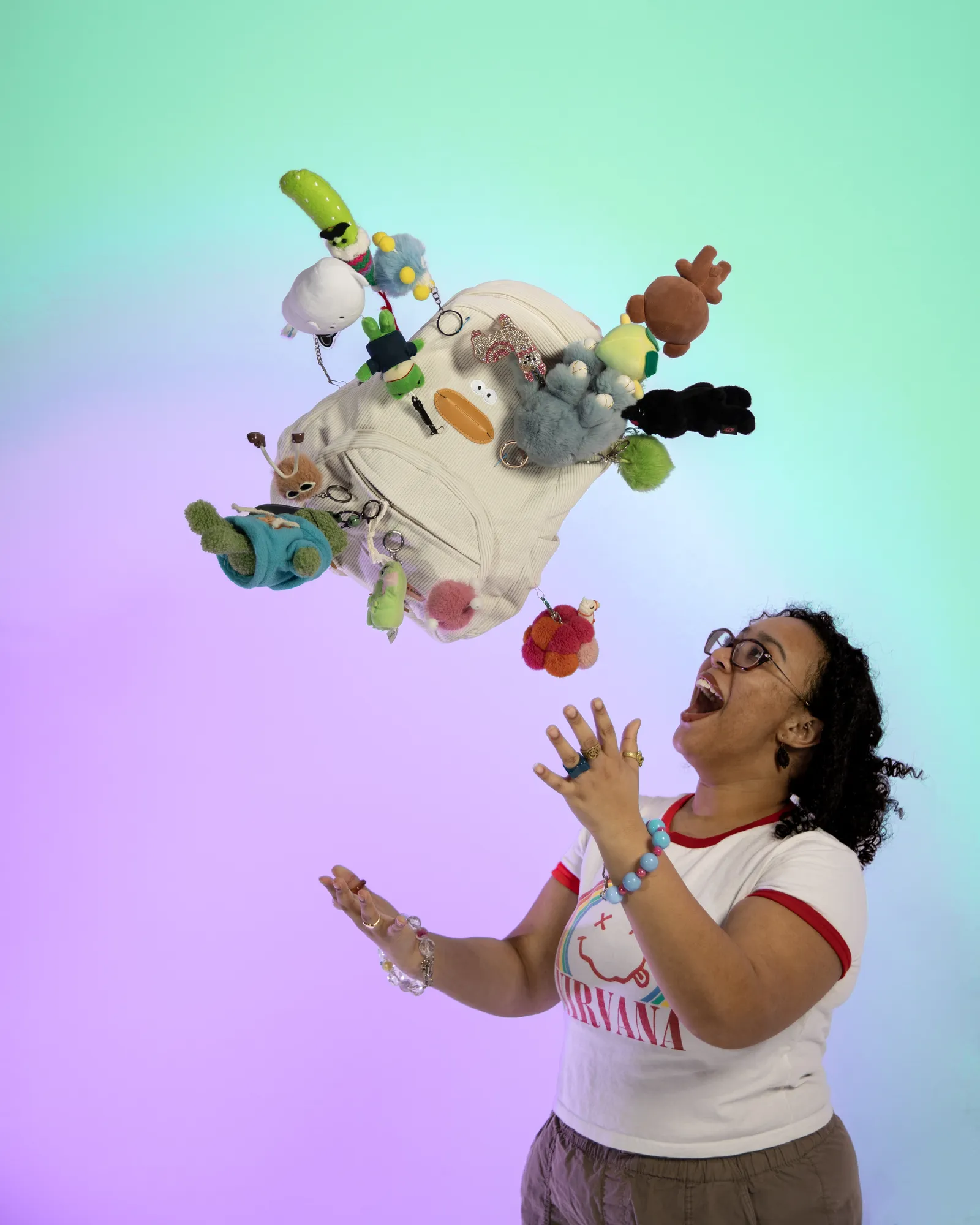
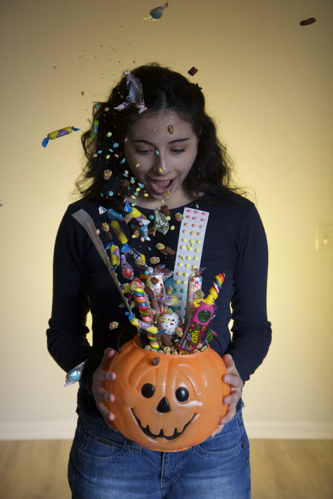
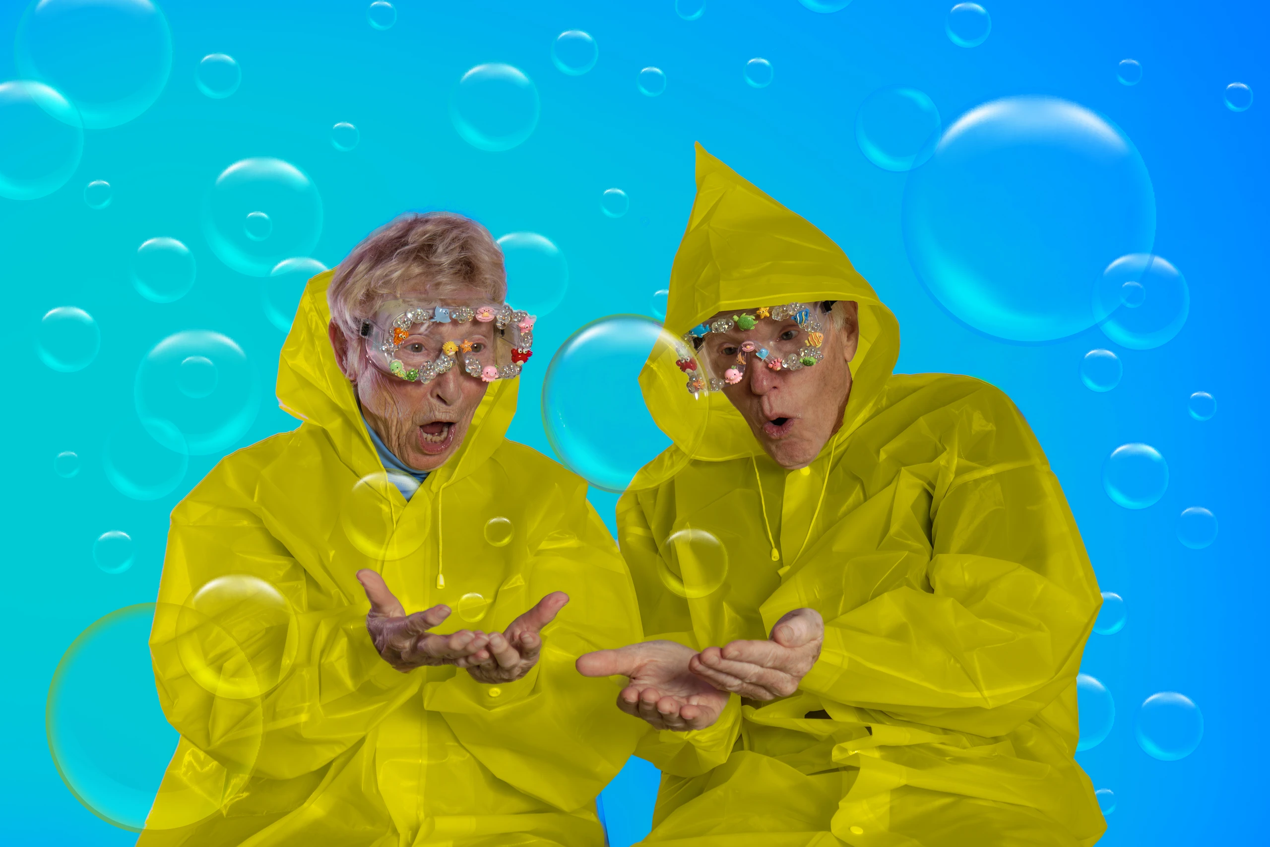
Creativity doesn’t have to be serious or structured; it can be messy, fun and childlike. I turned familiar things like rubber ducks, alphabet beads, stickers, pipe cleaners and toy jewelry into bold, colorful compositions that evoke nostalgia and wonder, and designed and hand-built 80% of the props and set pieces, plus hand-built wooden frames painted to color-match each image.

The outcome

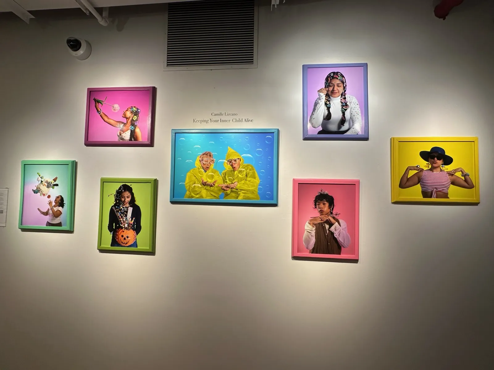
Across multiple shoots I refined more than 4,000 images down to one final frame per look. I curated the final seven-image series and directed its selection, sequencing, framing and installation for the NYU Tisch senior thesis exhibition, seen by an audience of 700+.
Keeping Your Inner Child Alive

Sketch → final

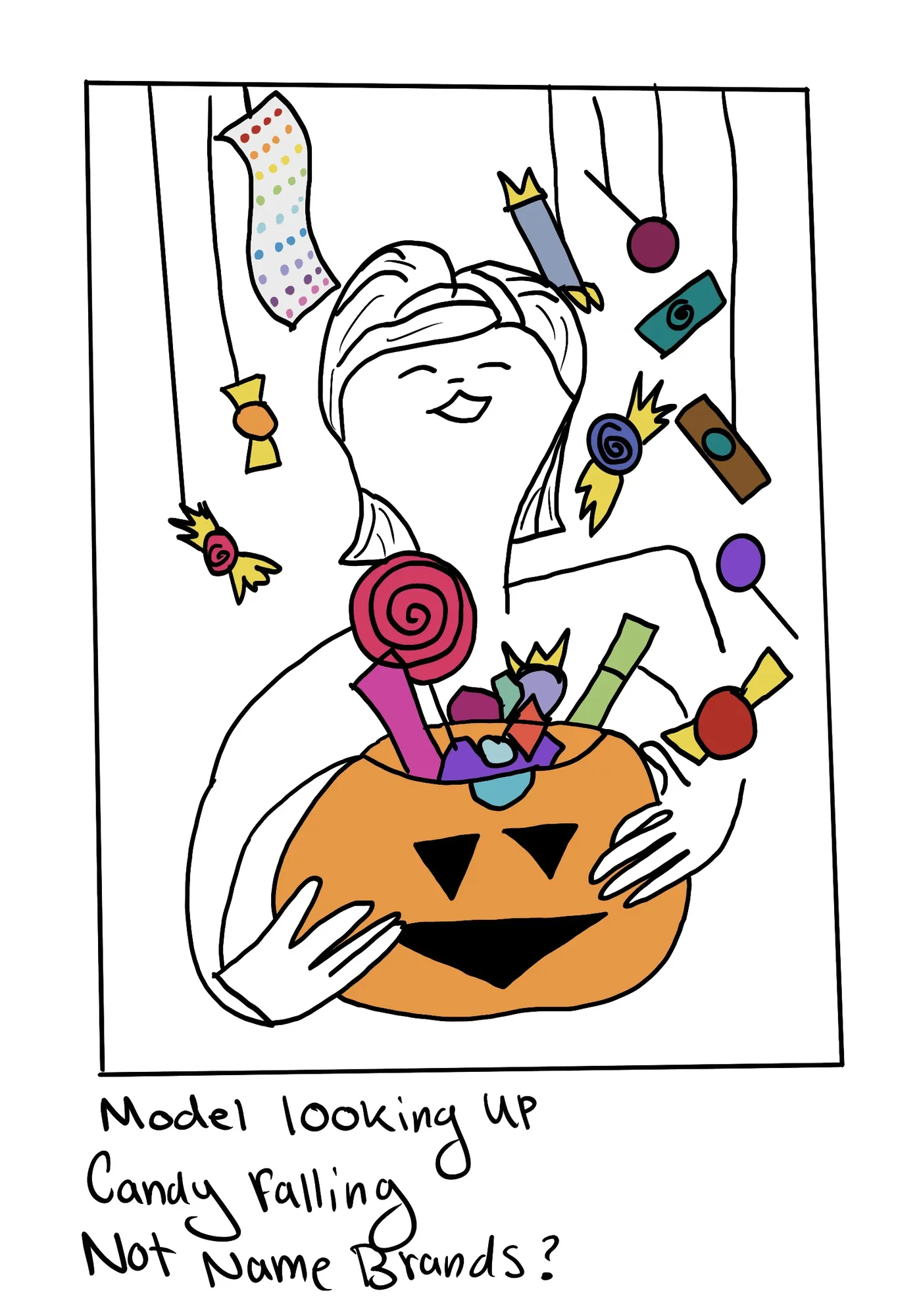
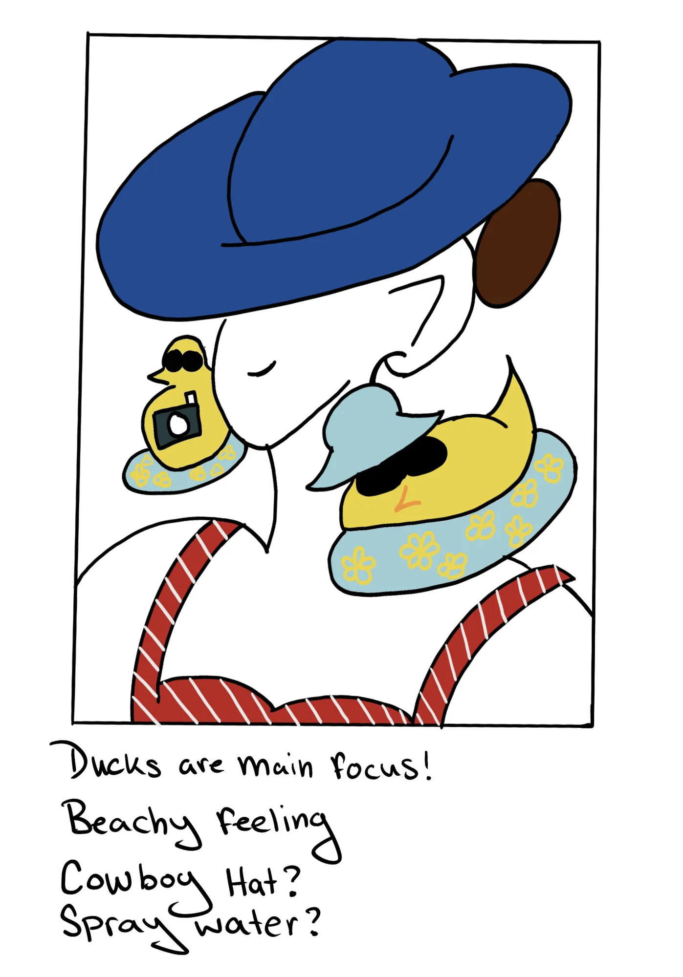
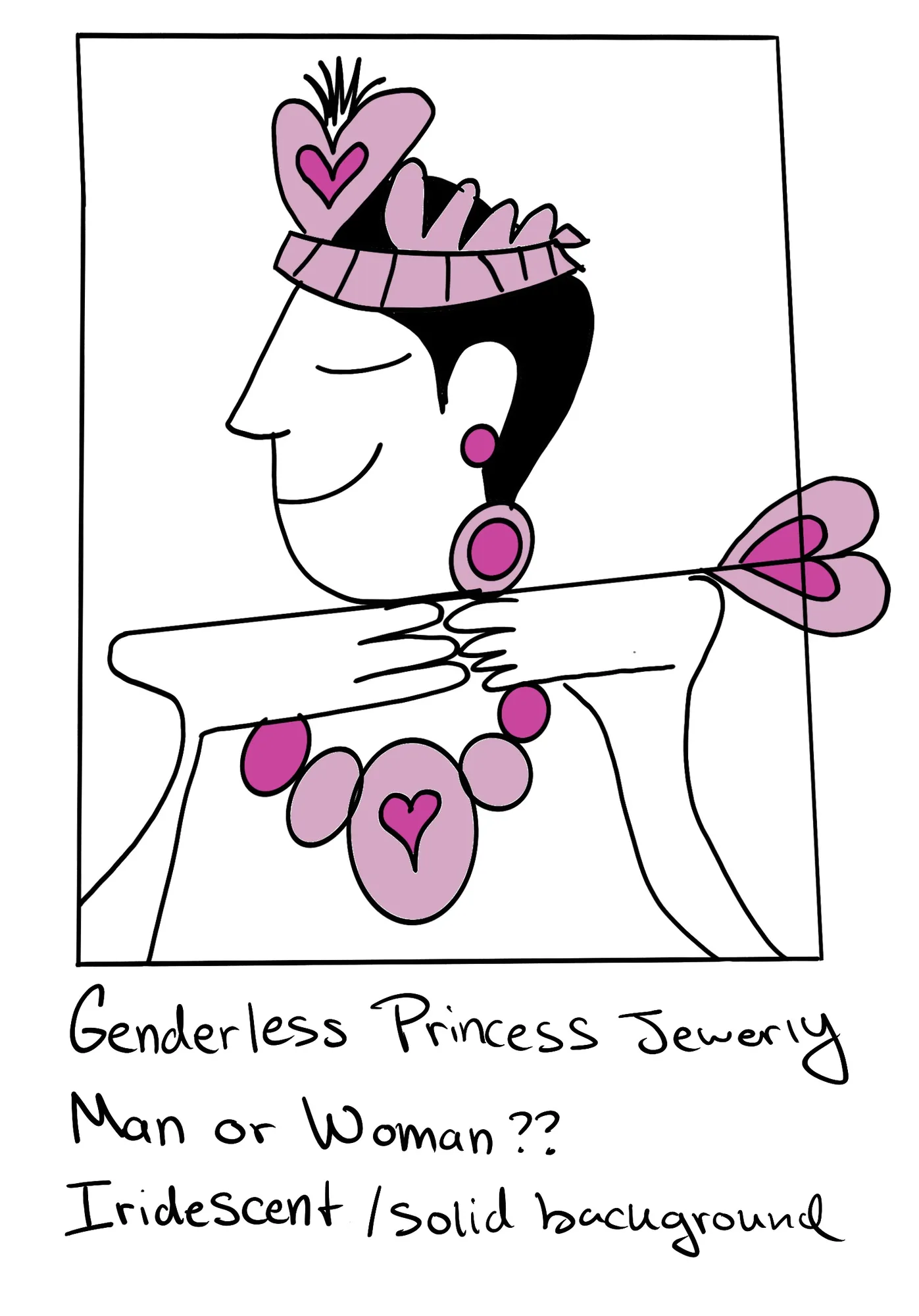
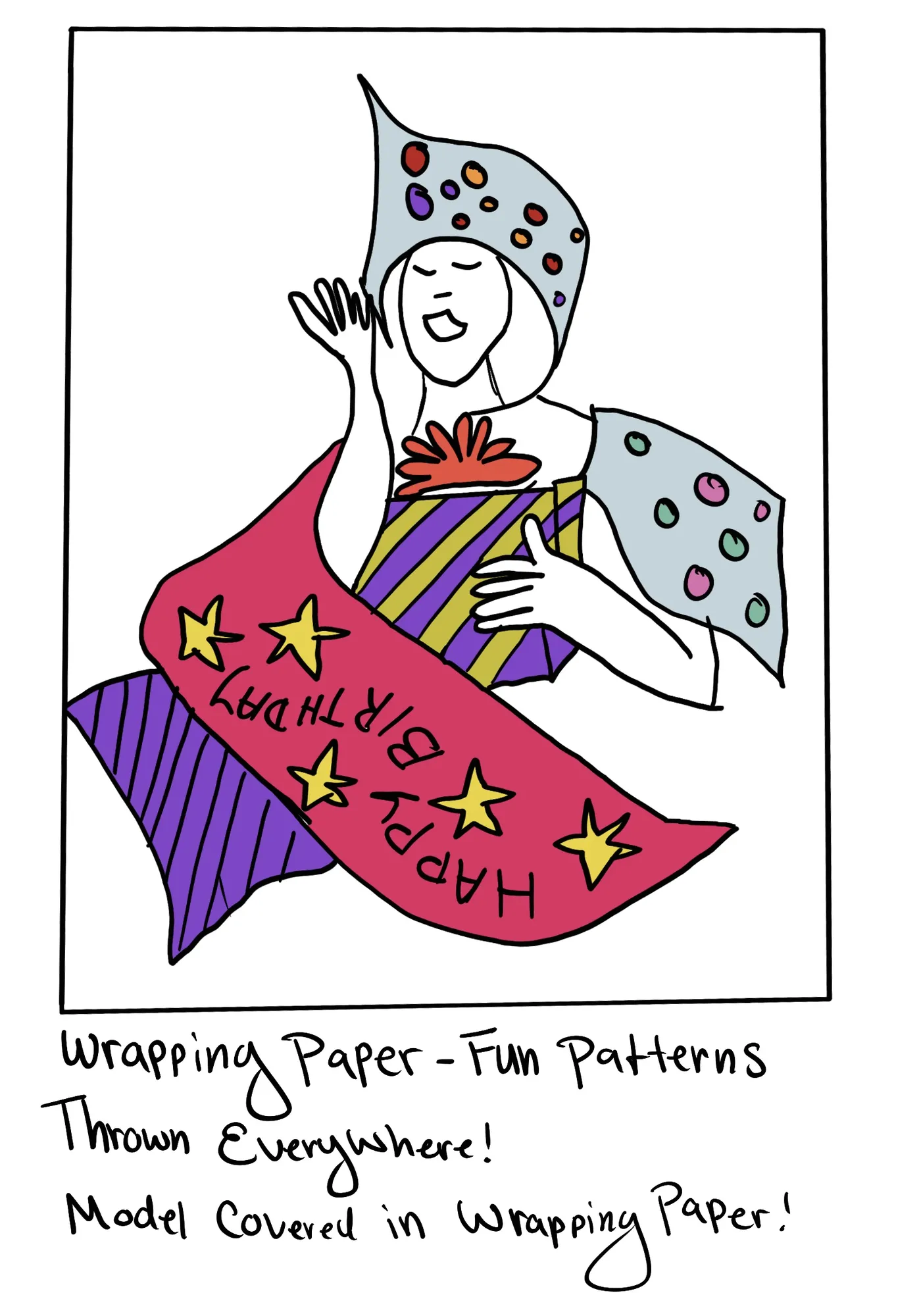
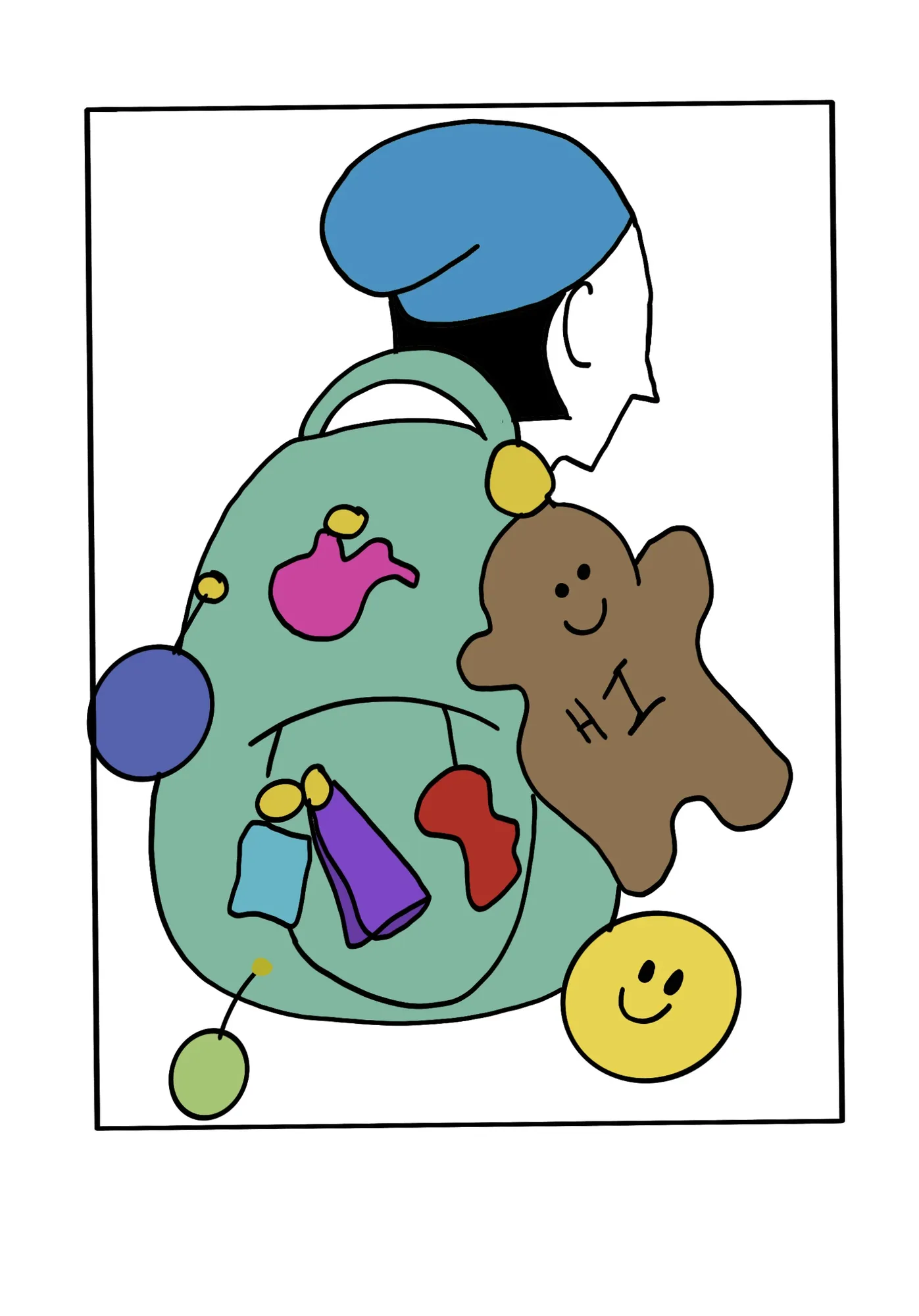
Every look started as a sketch, with notes on props, styling and background. Seven made it into the final series; two stayed on paper.
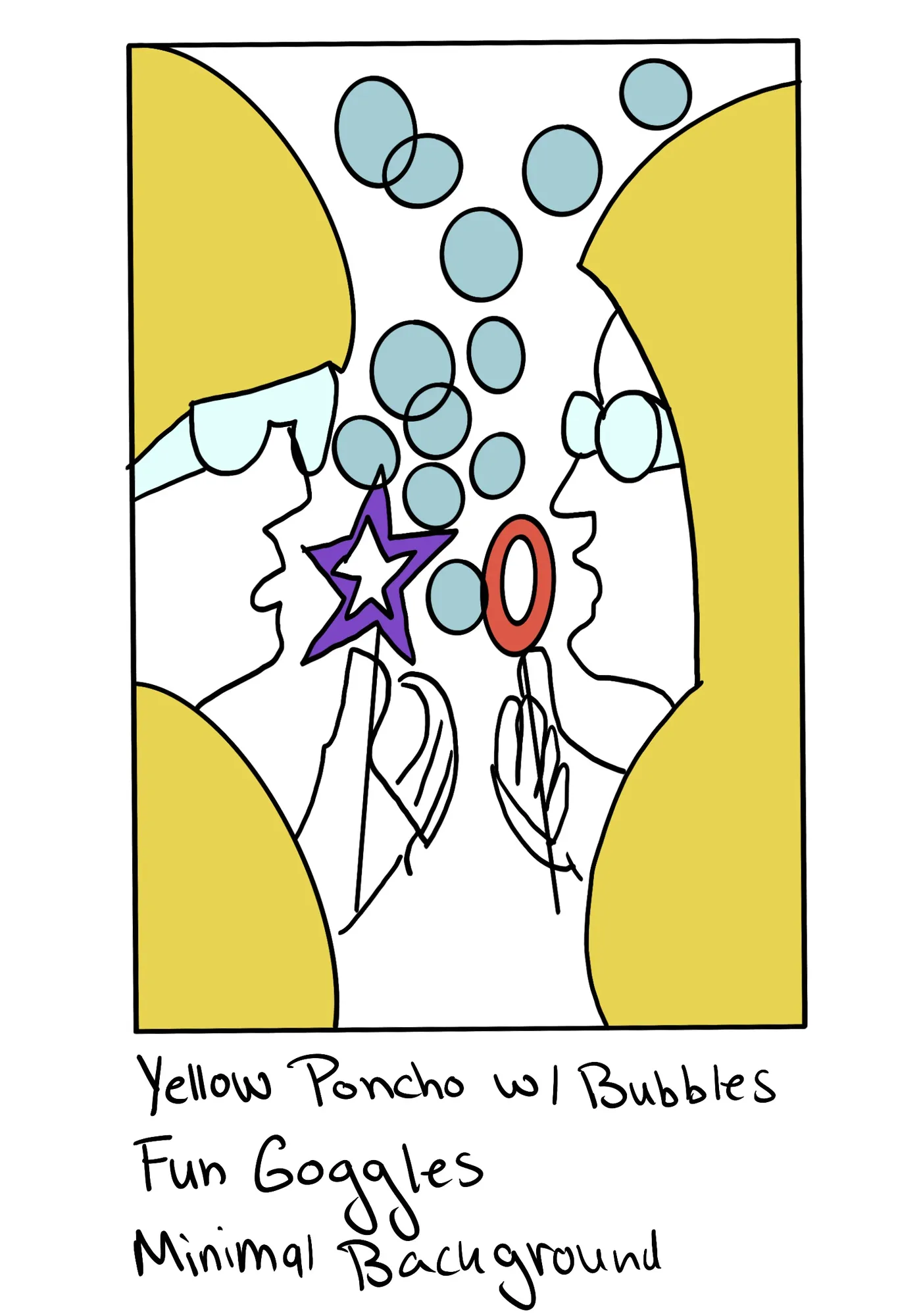
Bubbles — sketch
Bubbles — final
Bubbles
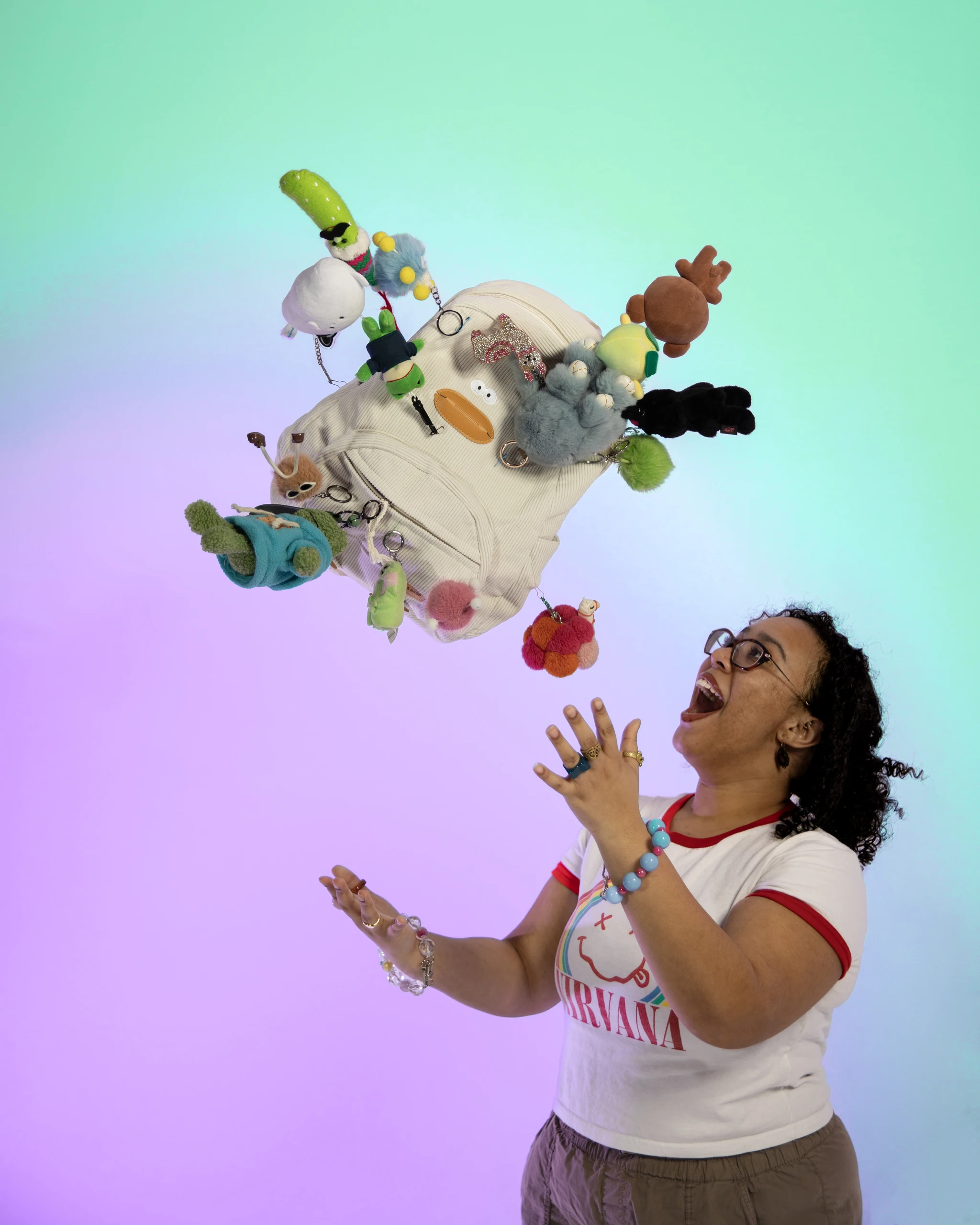
Bag charms — sketch
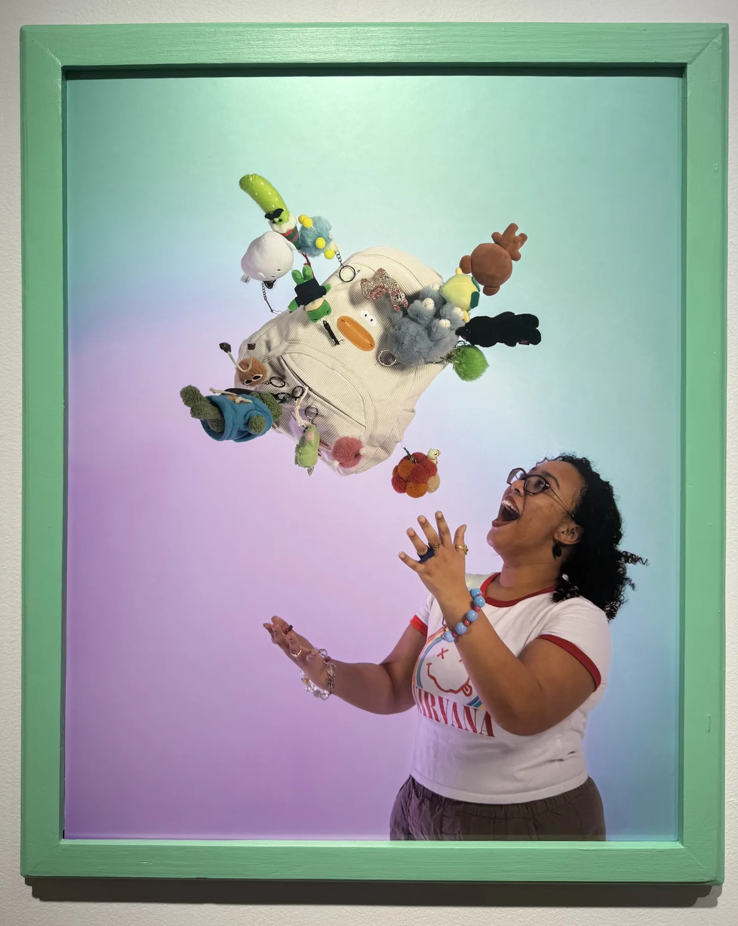
Bag charms — final
Bag charms
Candy — sketch
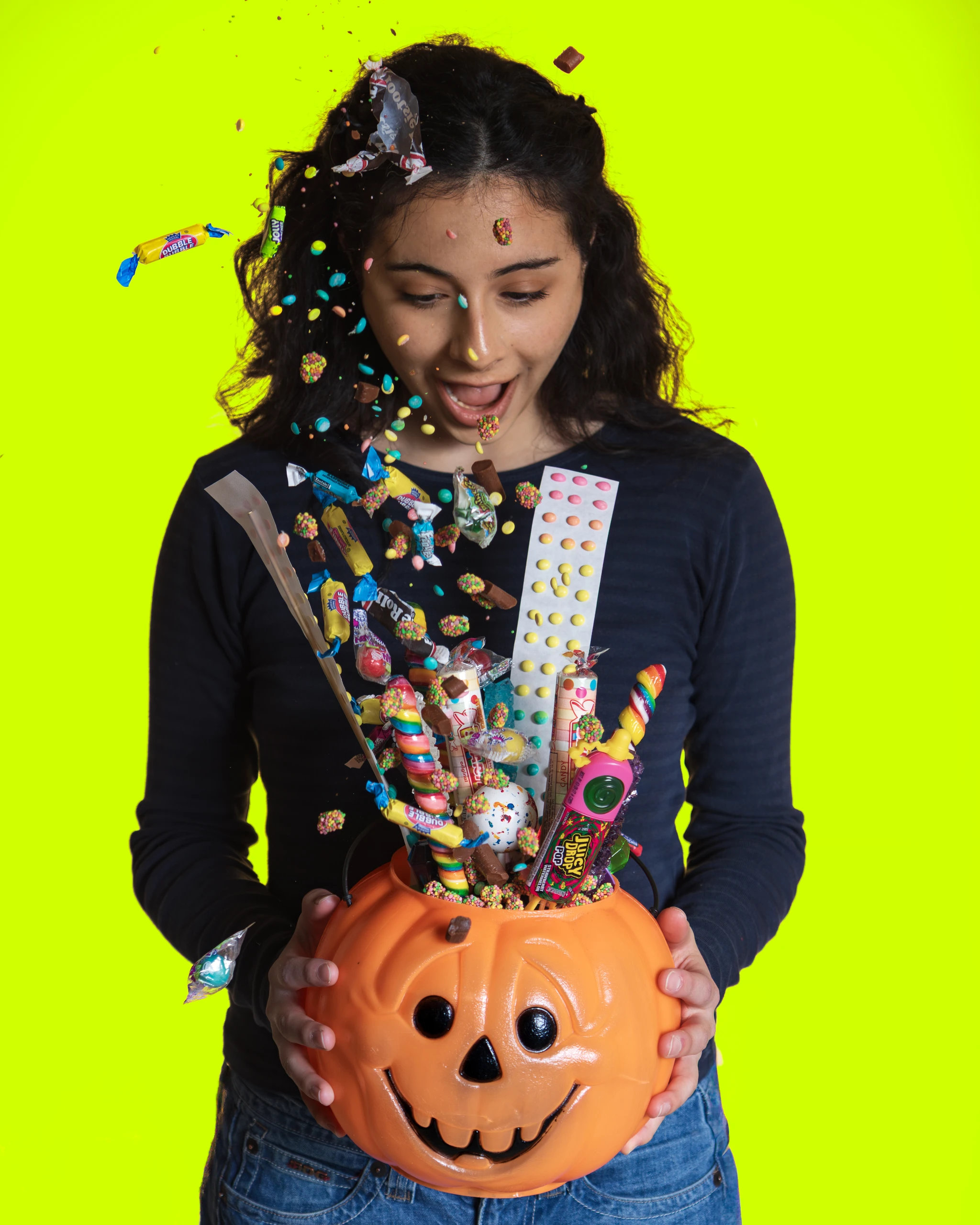
Candy — final
Candy
Ducks — sketch
Ducks — final
Ducks
Flowers — sketch
Flowers — final
Flowers
Princess jewelry — sketch
Princess jewelry — final
Princess jewelry
Stickers — sketch
Stickers — final
Stickers
Dinos — sketch
Gifts — sketch
Dinos & GiftsConcepts that stayed on paper

Building the world

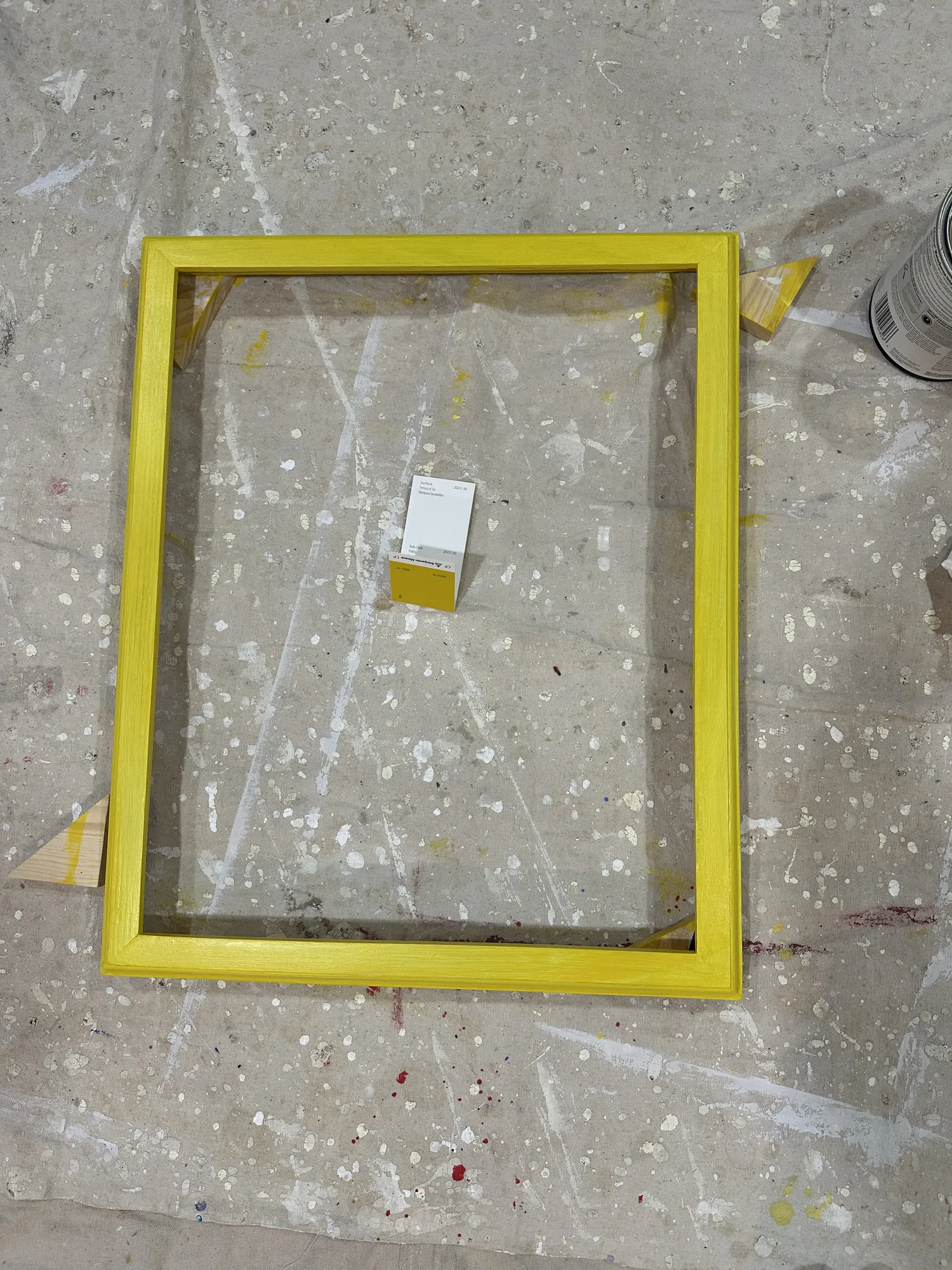
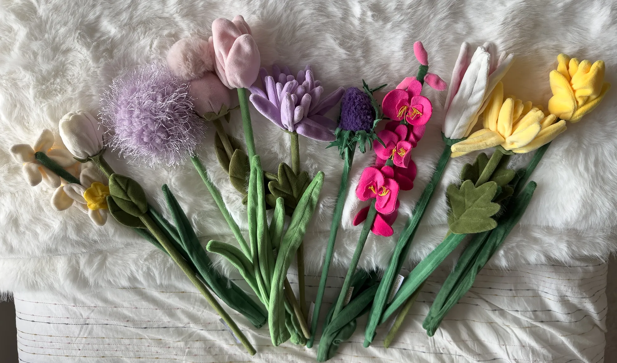
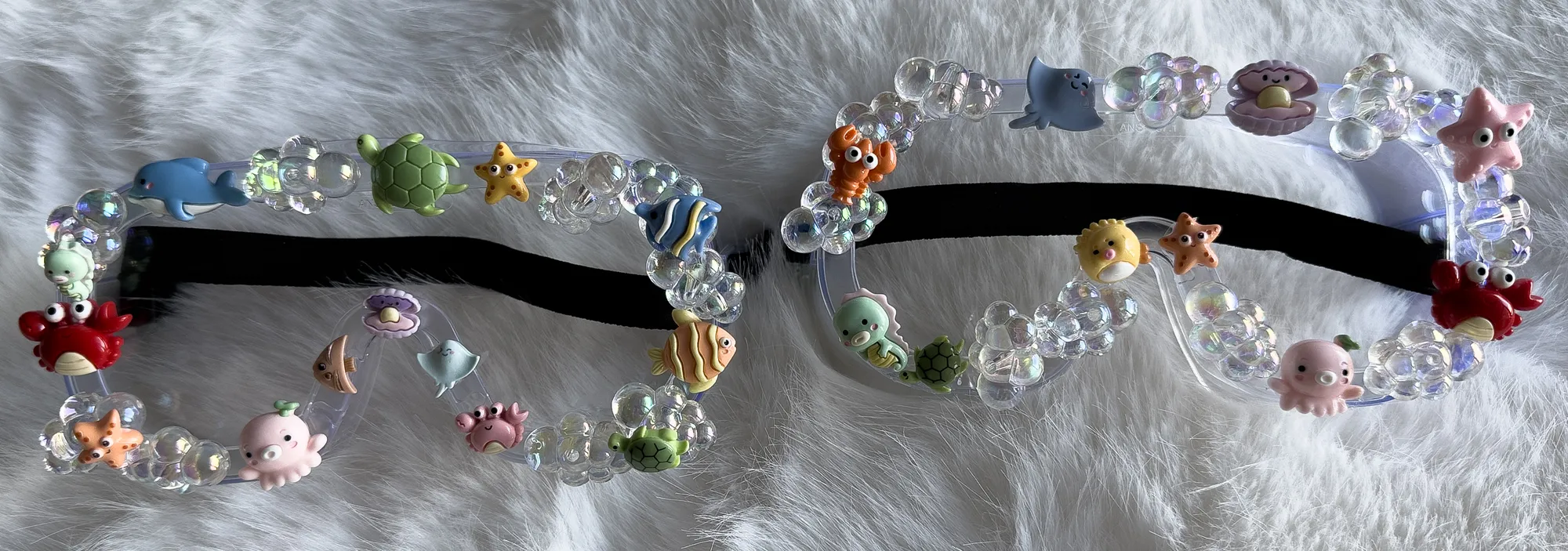
I designed and hand-built 80% of the props and set pieces, from charm-covered goggles to pipe-cleaner flowers, plus hand-built wooden frames painted to color-match each image.
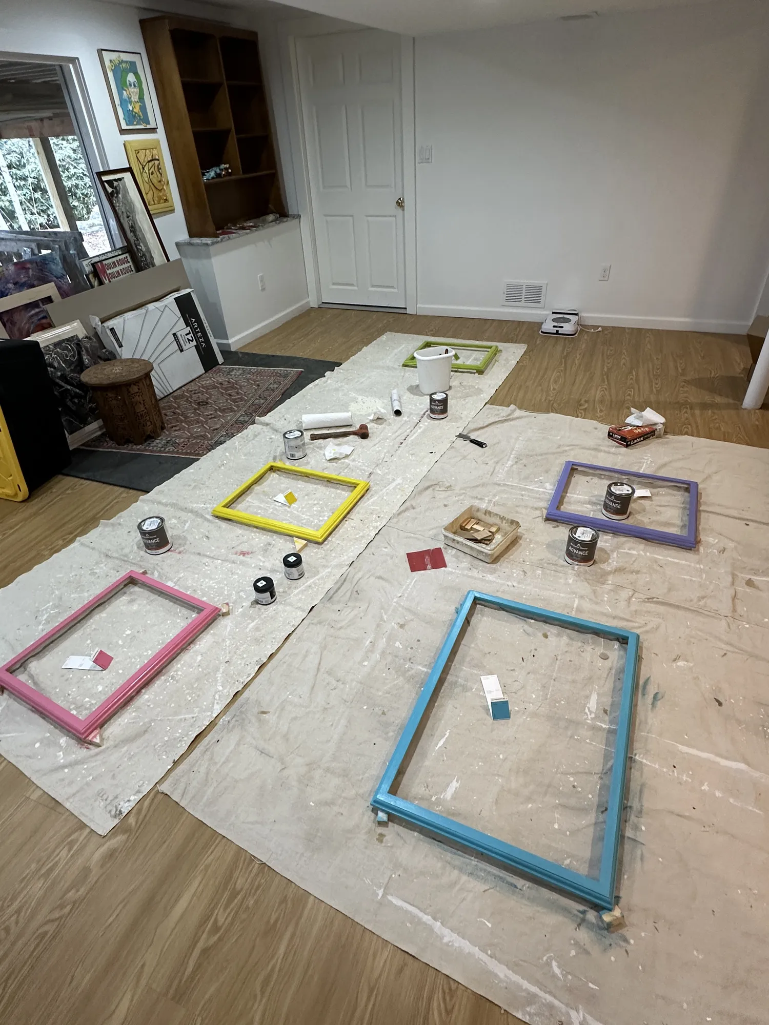
Frames laid out for painting
Hand-decorated goggles
Color-matched paint
Color-matched paint
Duck props
Duck props
Gluing & clamping
Gluing & clamping
Pipe-cleaner flowers
A finished frame
A finished frame
Fabric flowers
Fabric flowers

Original capture → final edit

From more than 4,000 captures I chose one frame per look, then built the final color and background in the edit.
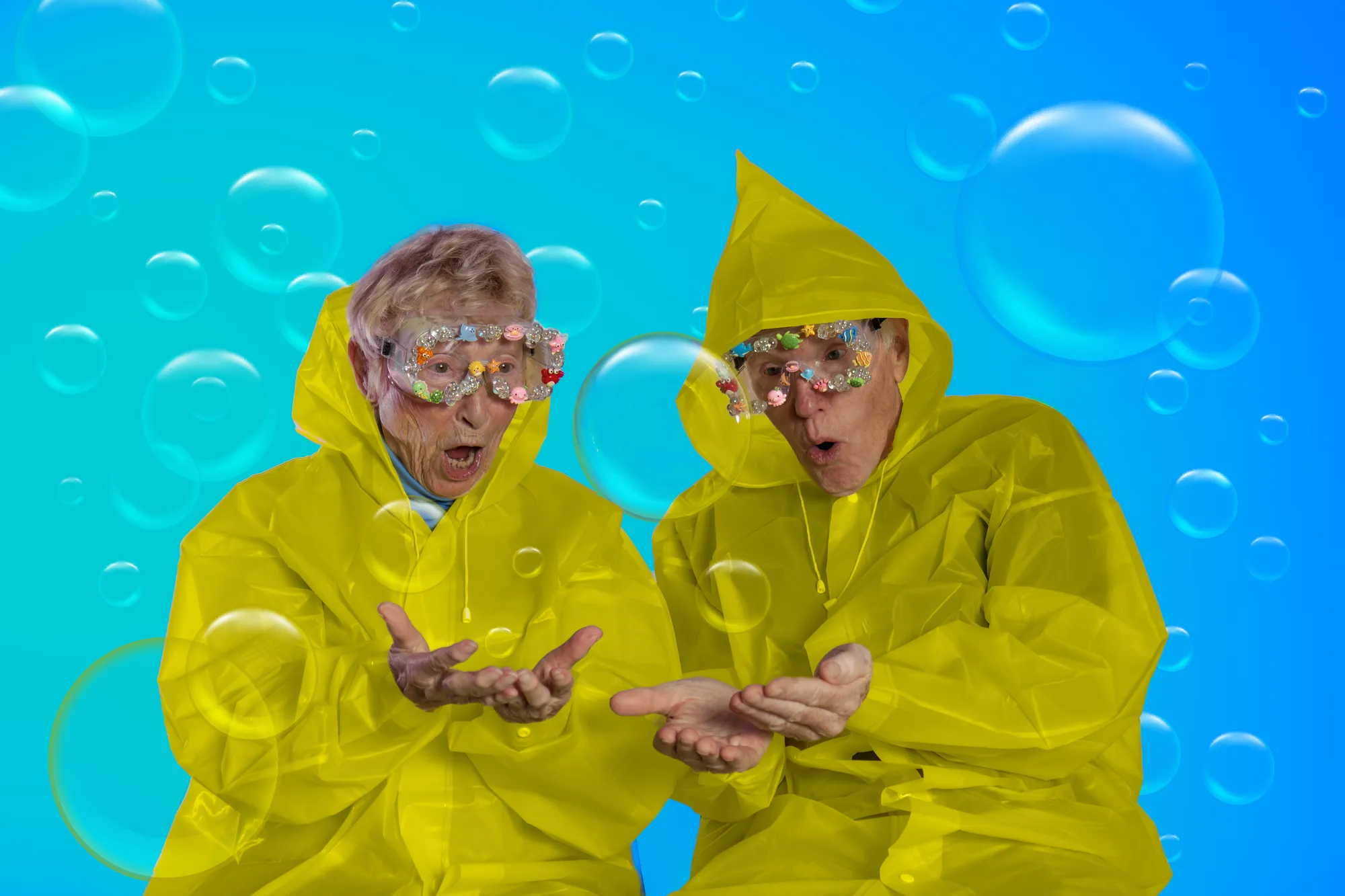
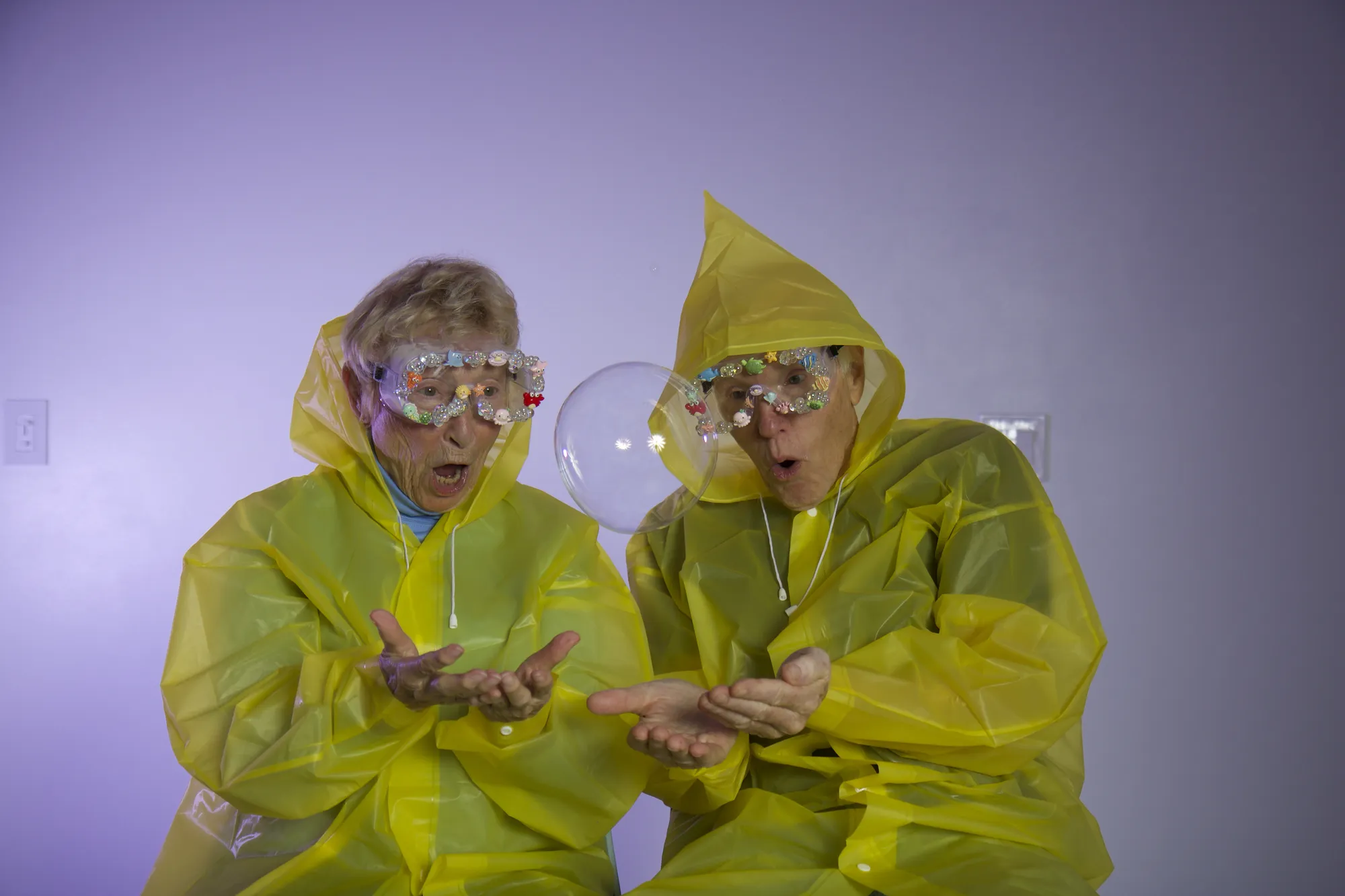
Bubbles — finalBubbles — originalOriginalFinal
⟷
Bag charms — finalBag charms — originalOriginalFinal
⟷
Candy — finalCandy — originalOriginalFinal
⟷
Stickers — finalStickers — originalOriginalFinal
⟷

Drag to compare

The final series

Series image
Series image
Series image
Series image
Series image
Series image
Series image

The exhibition

I mapped out the wall before hanging it, with each print in a frame painted to match its image. Then I directed the selection, sequencing, framing and installation for the NYU Tisch senior thesis exhibition, seen by an audience of 700+.
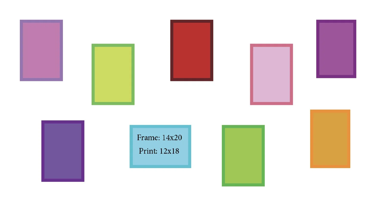
Wall planWall plan
InstalledInstalled
Series image
Series image
02
Concept makeup brand · Class project · 2025

PRISM.A

The brief

Build a brand identity and Instagram campaign for a new makeup brand, working from a given creative brief.

The idea

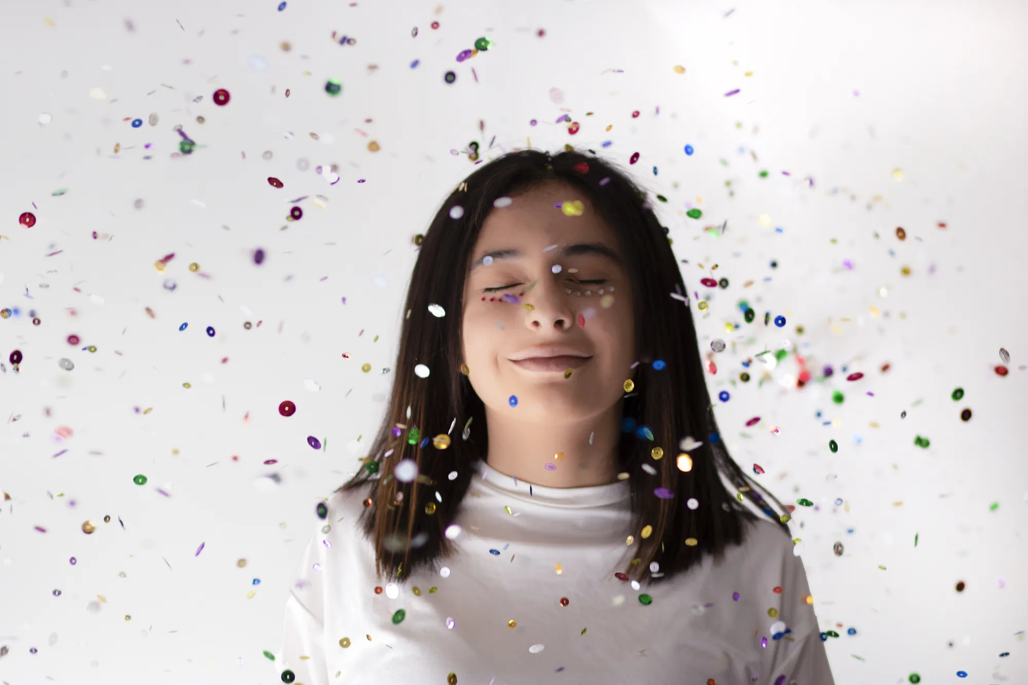
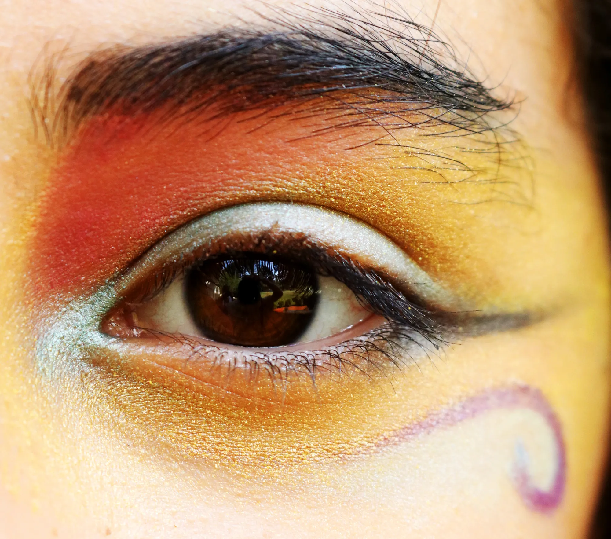
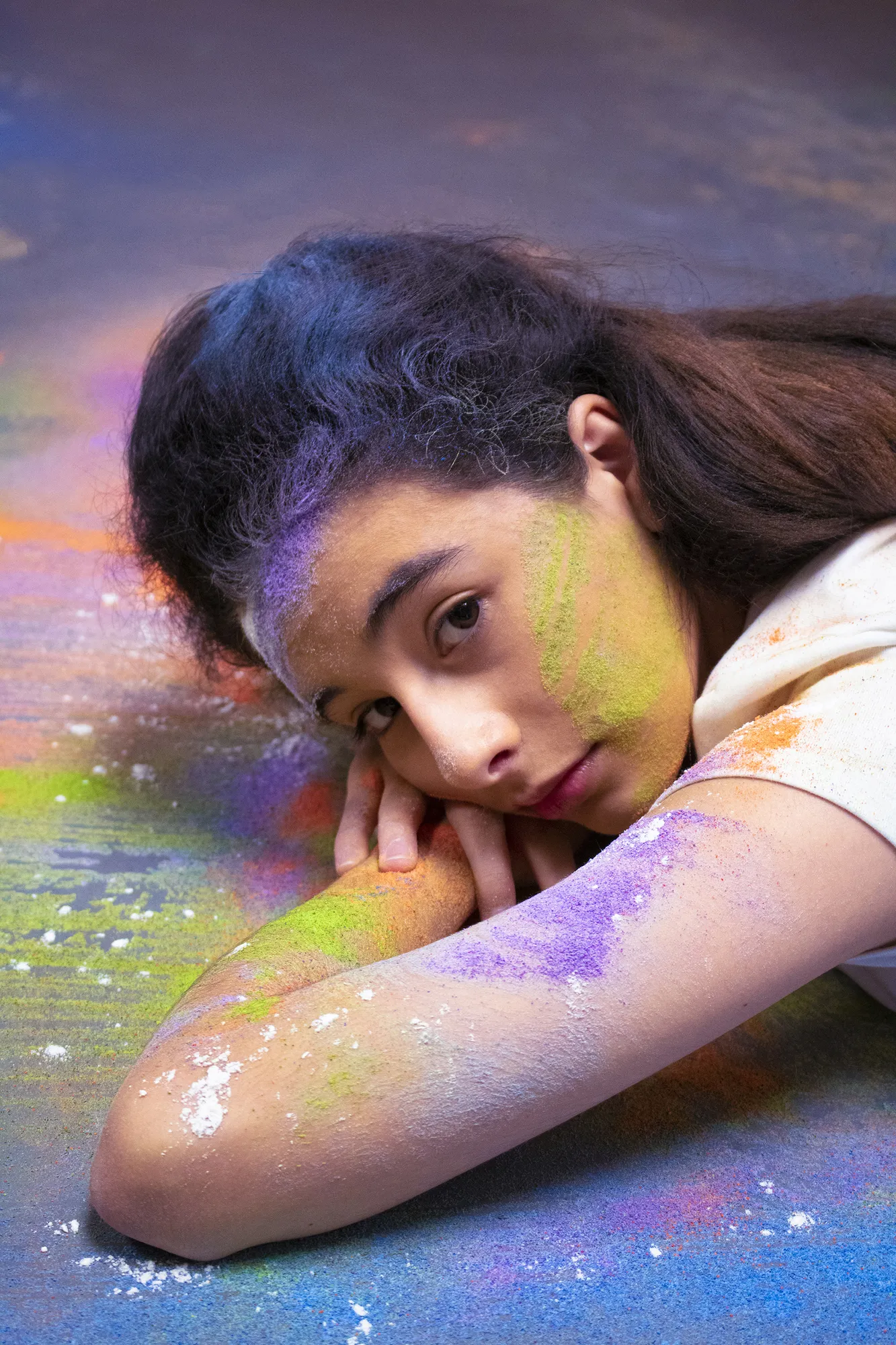
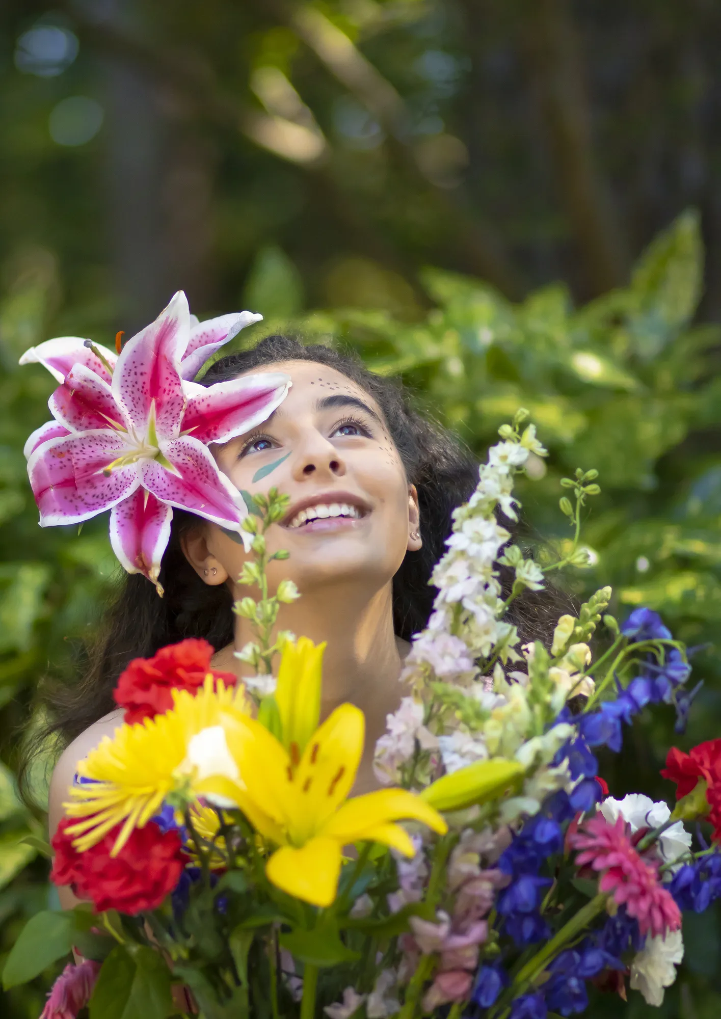
PRISM.A is built around one line: “where color can break the boundaries of makeup and have fun.” I set the logo, color palette, typography and visual tone, then shot original campaign portraits with confetti, paint and flowers to carry that energy.

The outcome

A complete launch system: marketing materials, a planned feed grid, reusable post templates and ad creative, with product images built from sourced photos.
PRISM.A

The campaign shoot

I shot original portraits to carry the brand: confetti, paint, flowers and bold color on skin.

Series image
Series image
Series image
Series image

Sourced photo → PRISM.A product image

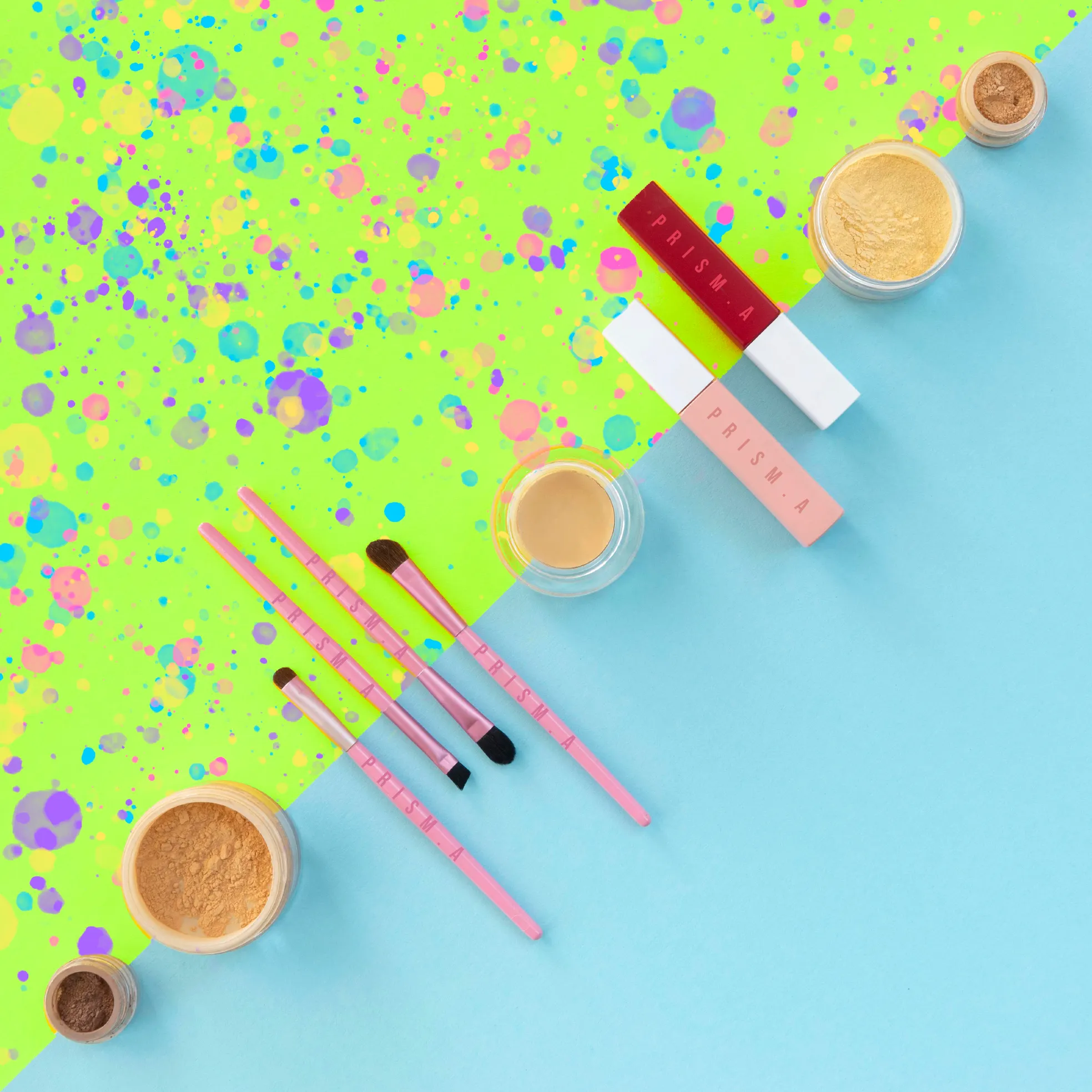
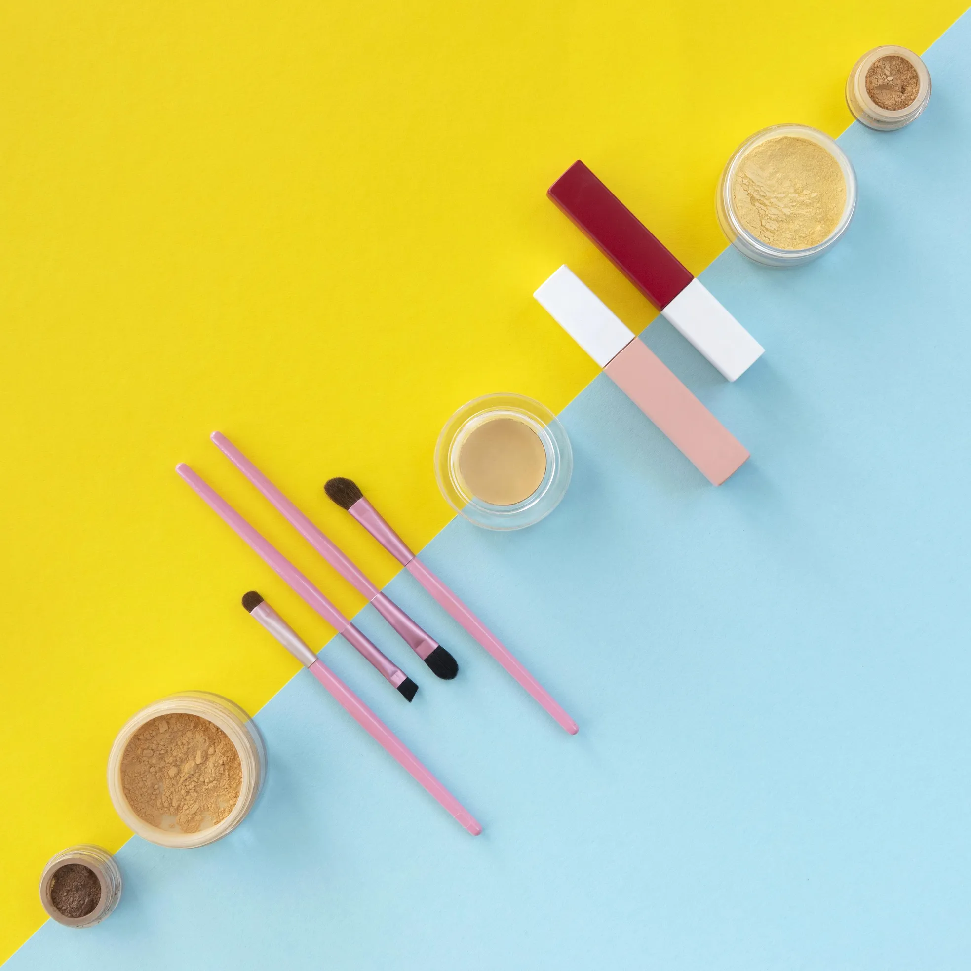
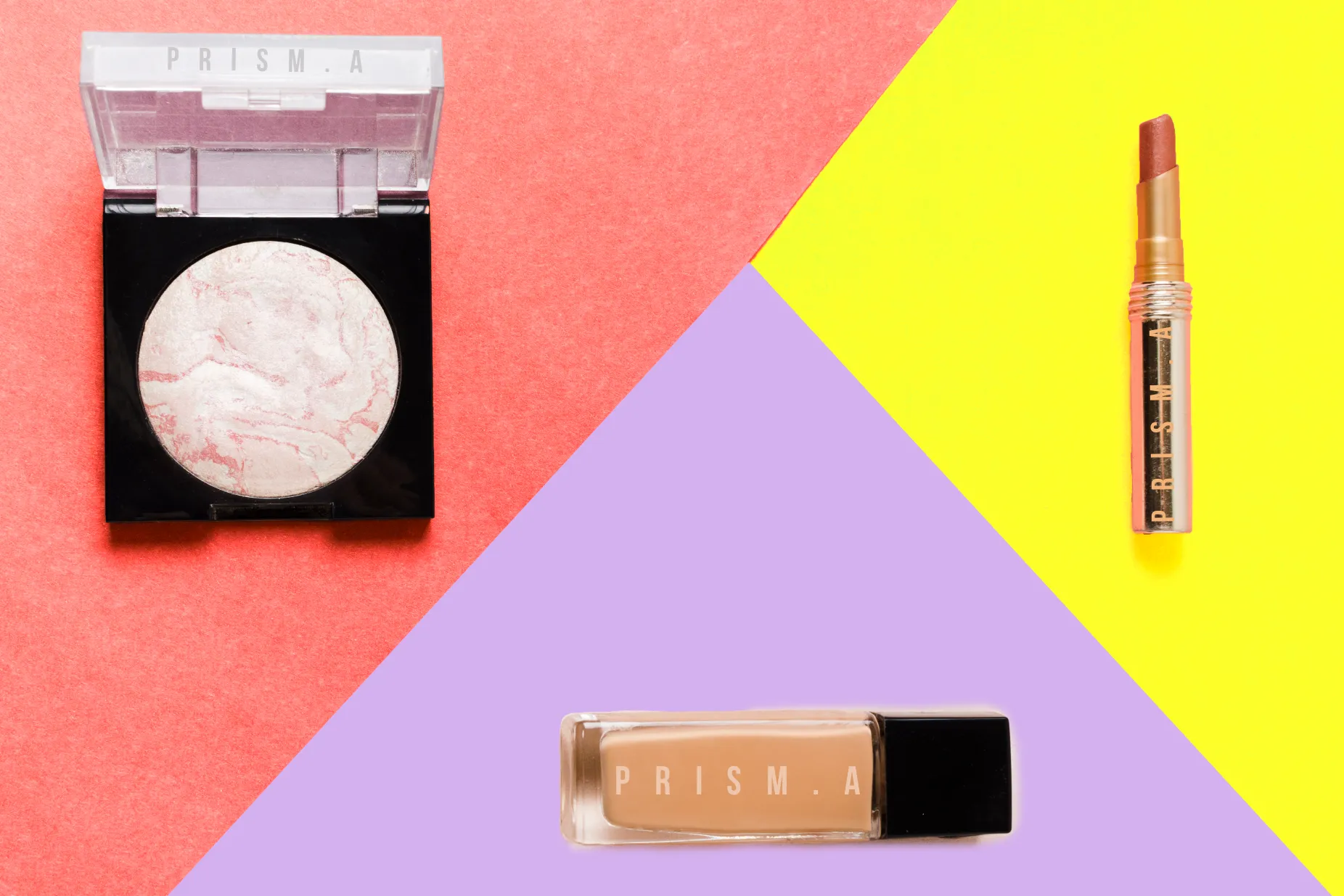
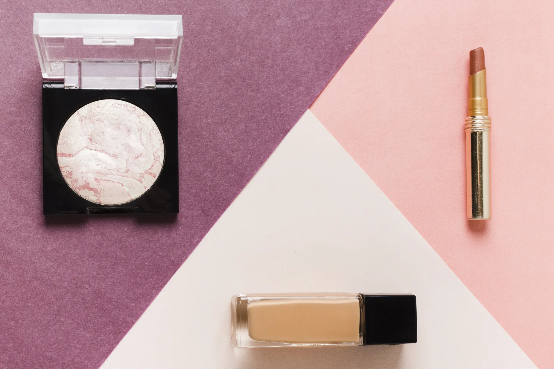
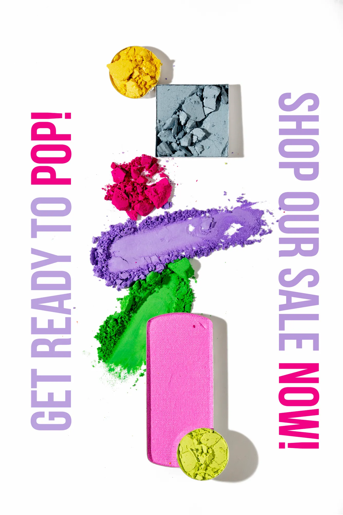
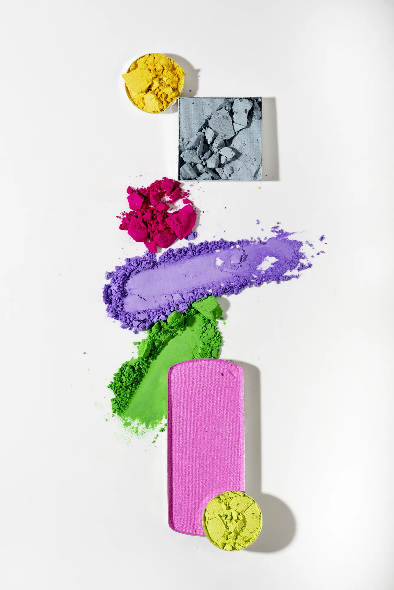
Product images started from sourced stock photos. I rebuilt each one for the brand: the PRISM.A logo on every product, colors pushed to the brand palette, and type and texture layered in.

Brushes & powders — finalBrushes & powders — originalSourced photoPRISM.A
⟷
Complexion set — finalComplexion set — originalSourced photoPRISM.A
⟷
Sale post — finalSale post — originalSourced photoPRISM.A
⟷

Drag to compare

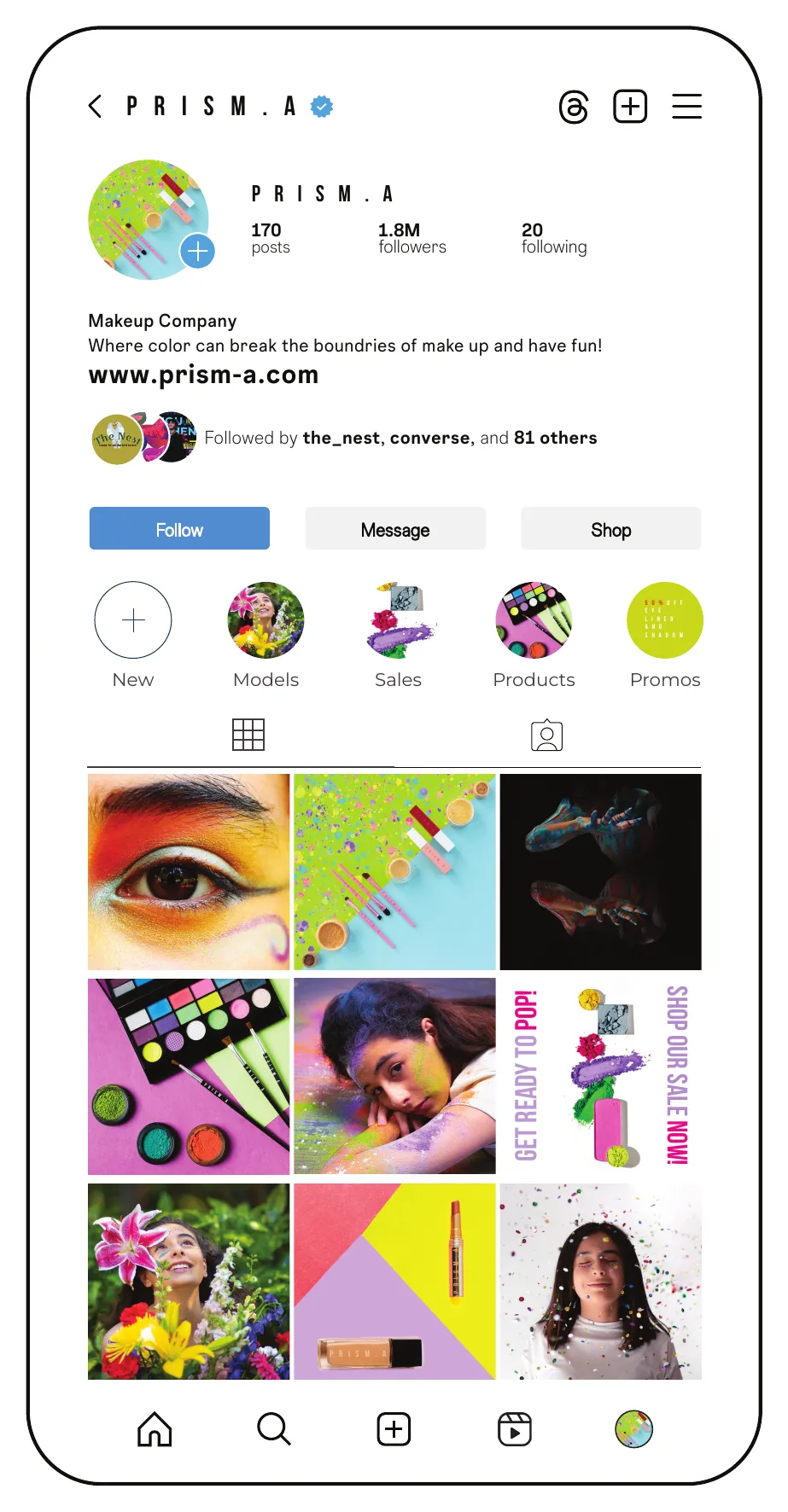
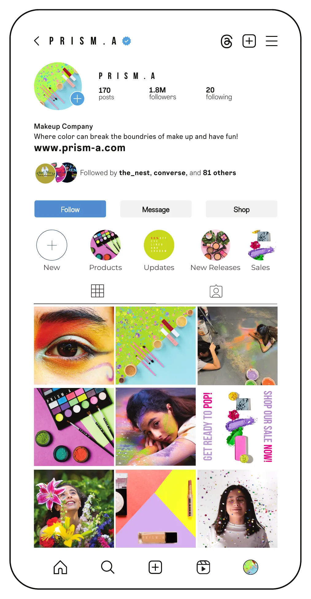
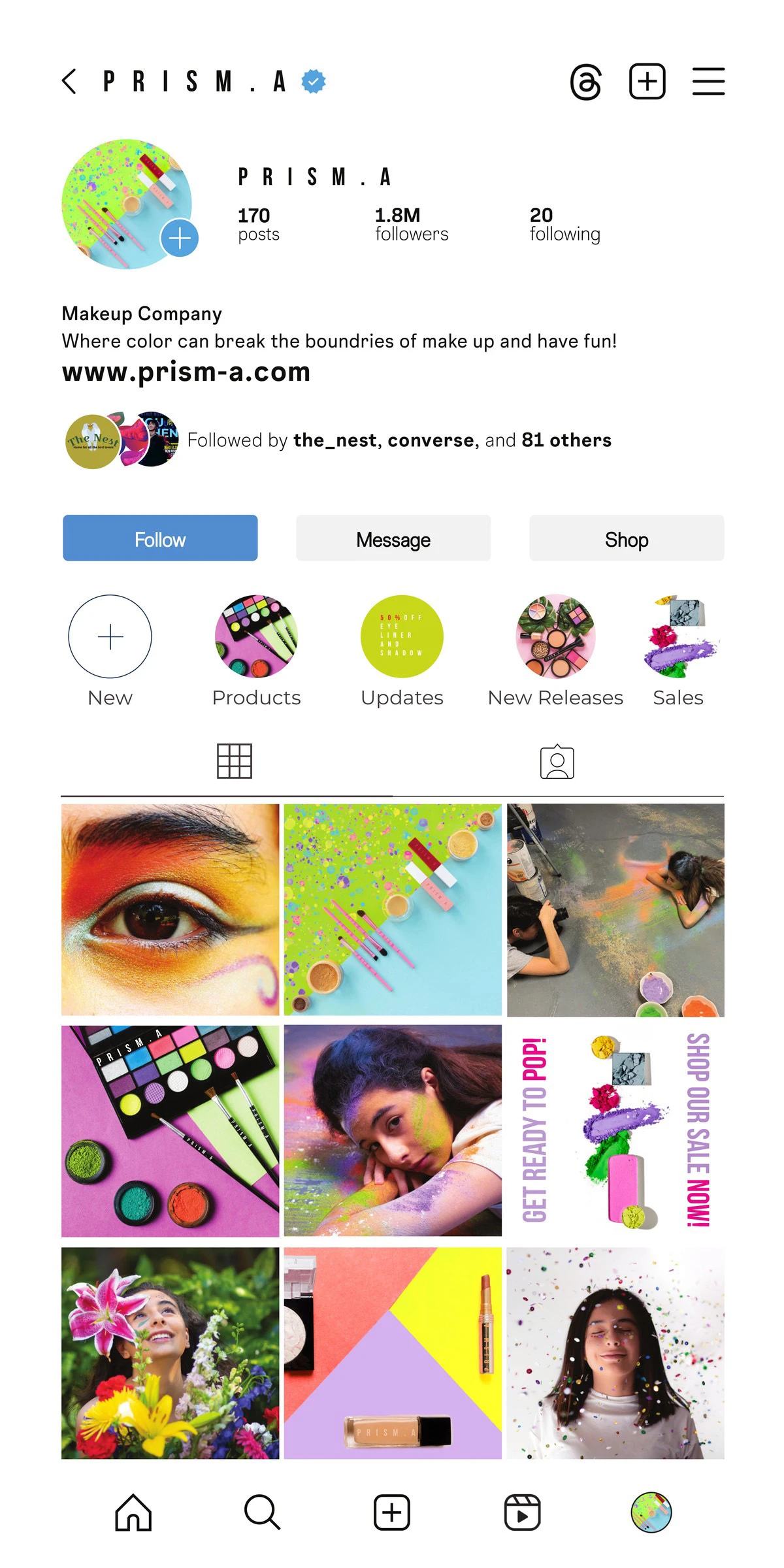
Draft → final profile

The first draft of the profile page next to the final version.

DraftDraft
FinalFinal

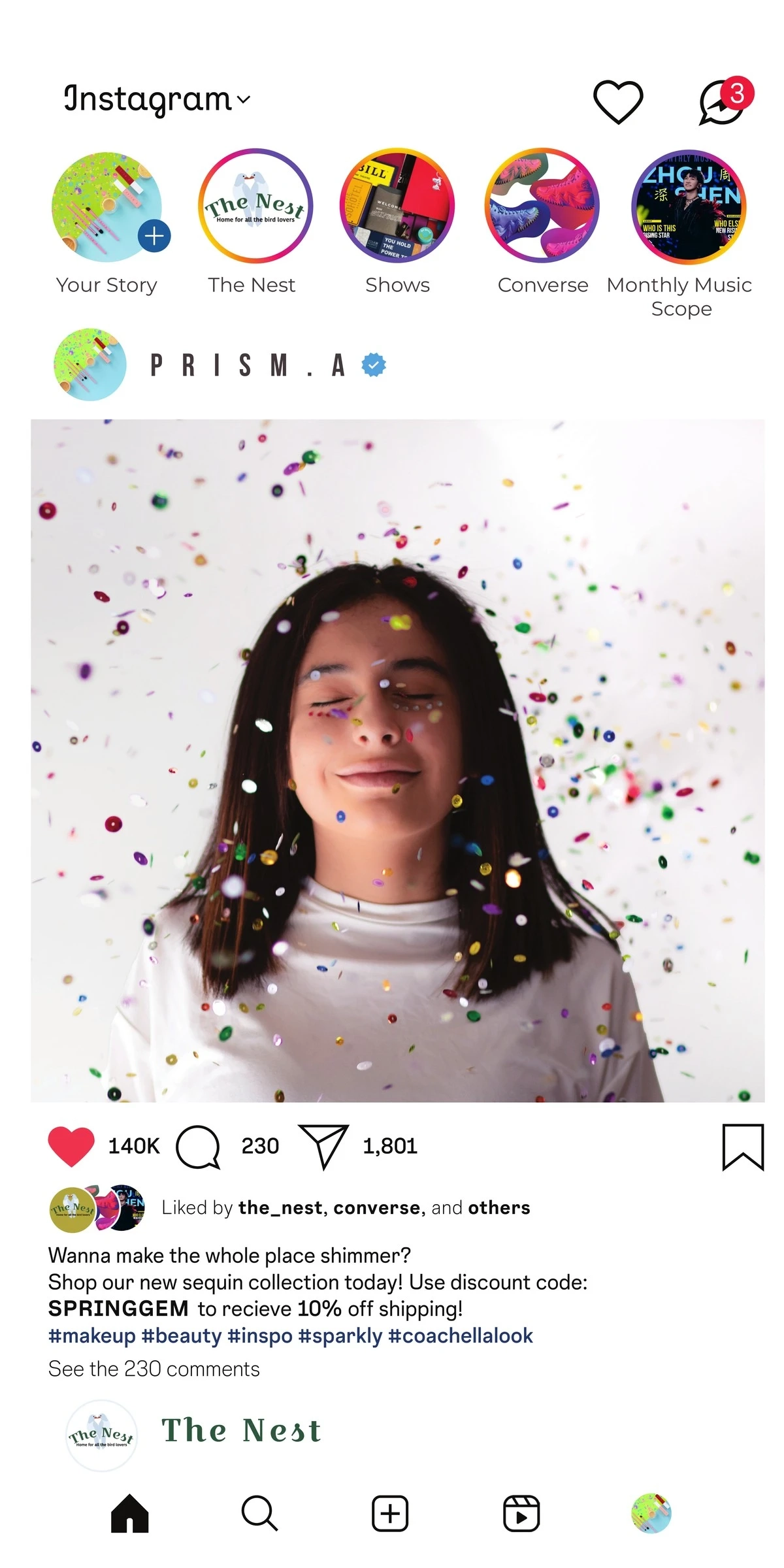
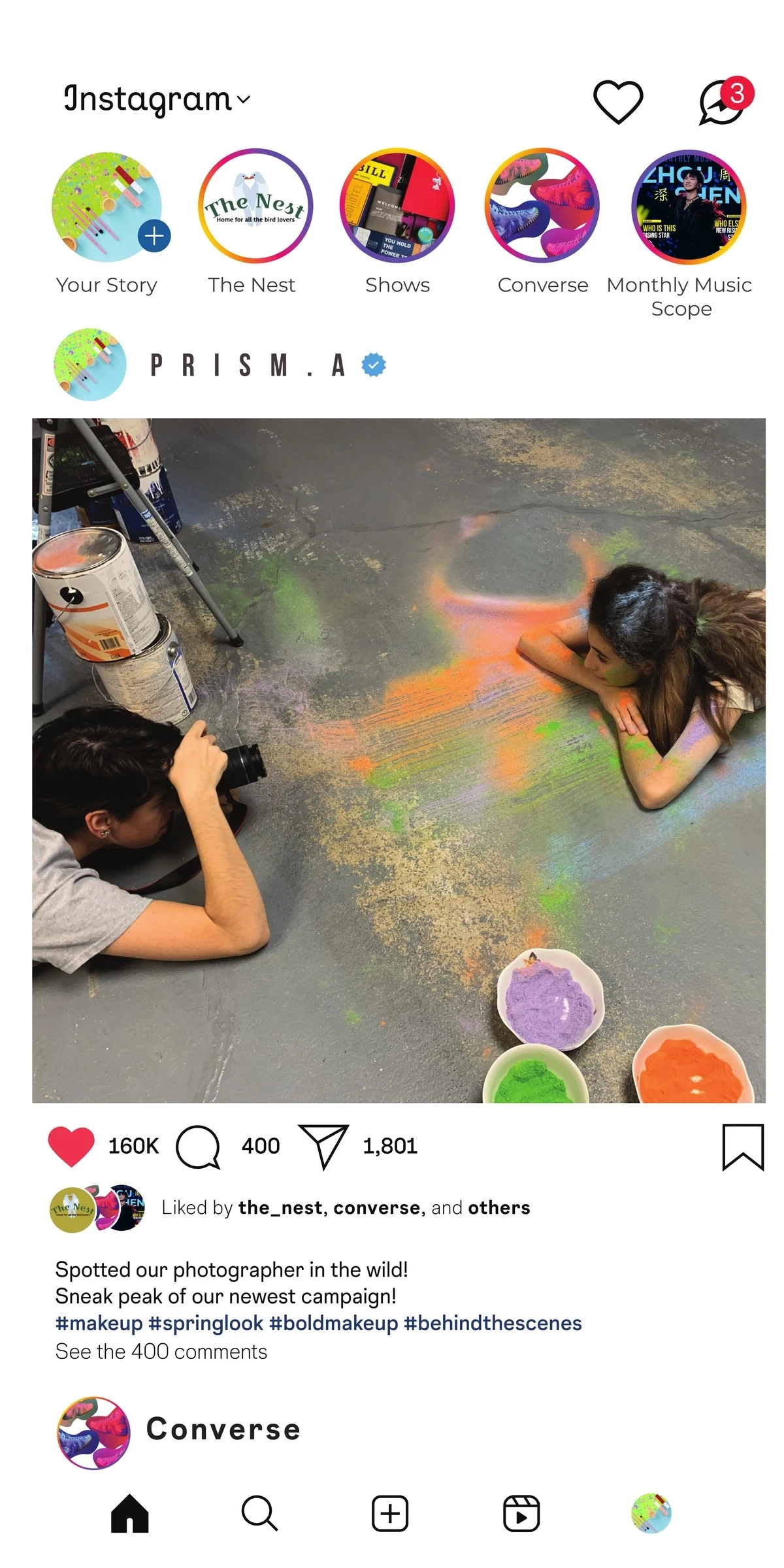
The Instagram campaign

Screen 1
Screen 2
Screen 3

Click a screen to see it on the phone

03
Bird-watching shop · Lower East Side · 2025

The Nest

The brief

Create a brand identity and guidelines for The Nest, a bird-watching shop on the Lower East Side selling binoculars, field guides, feeders, outdoor gear and weekend bird-watching tours.

The idea

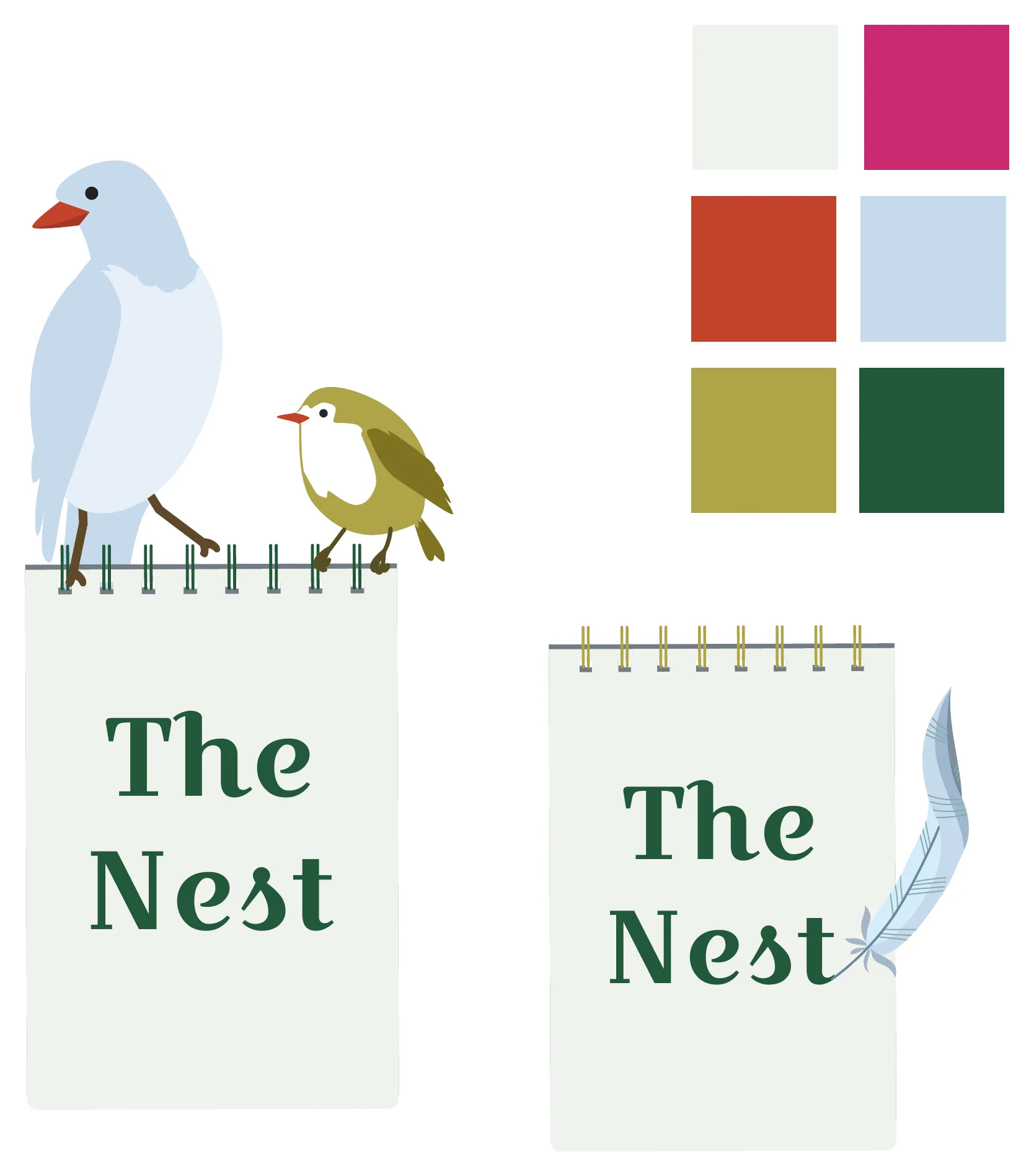
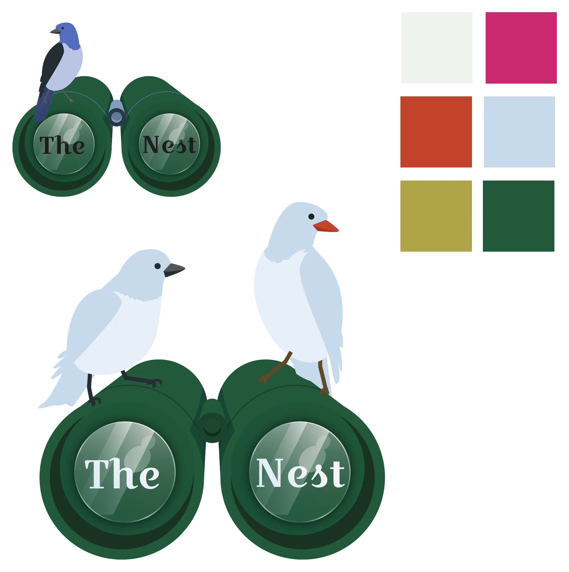
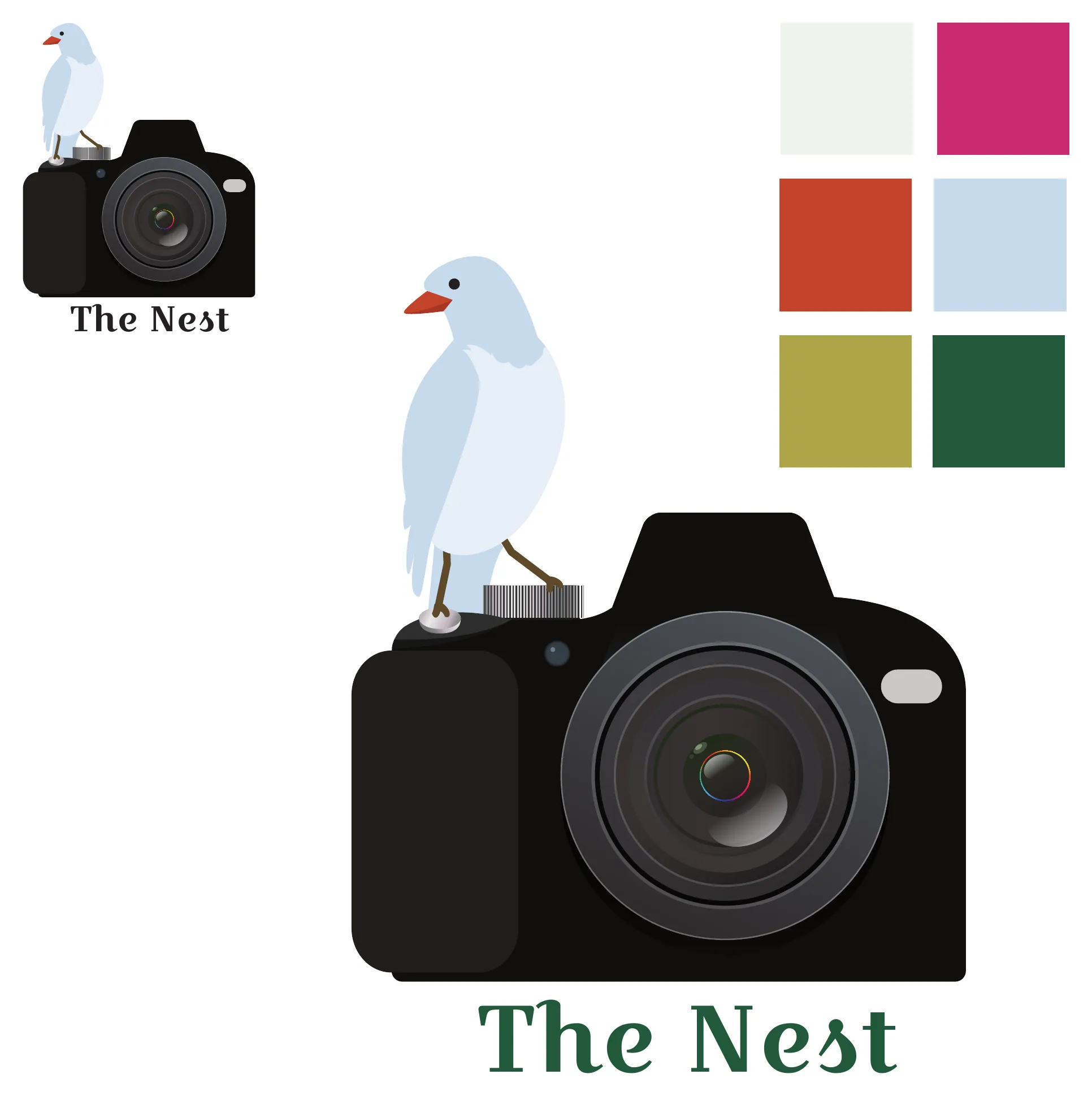
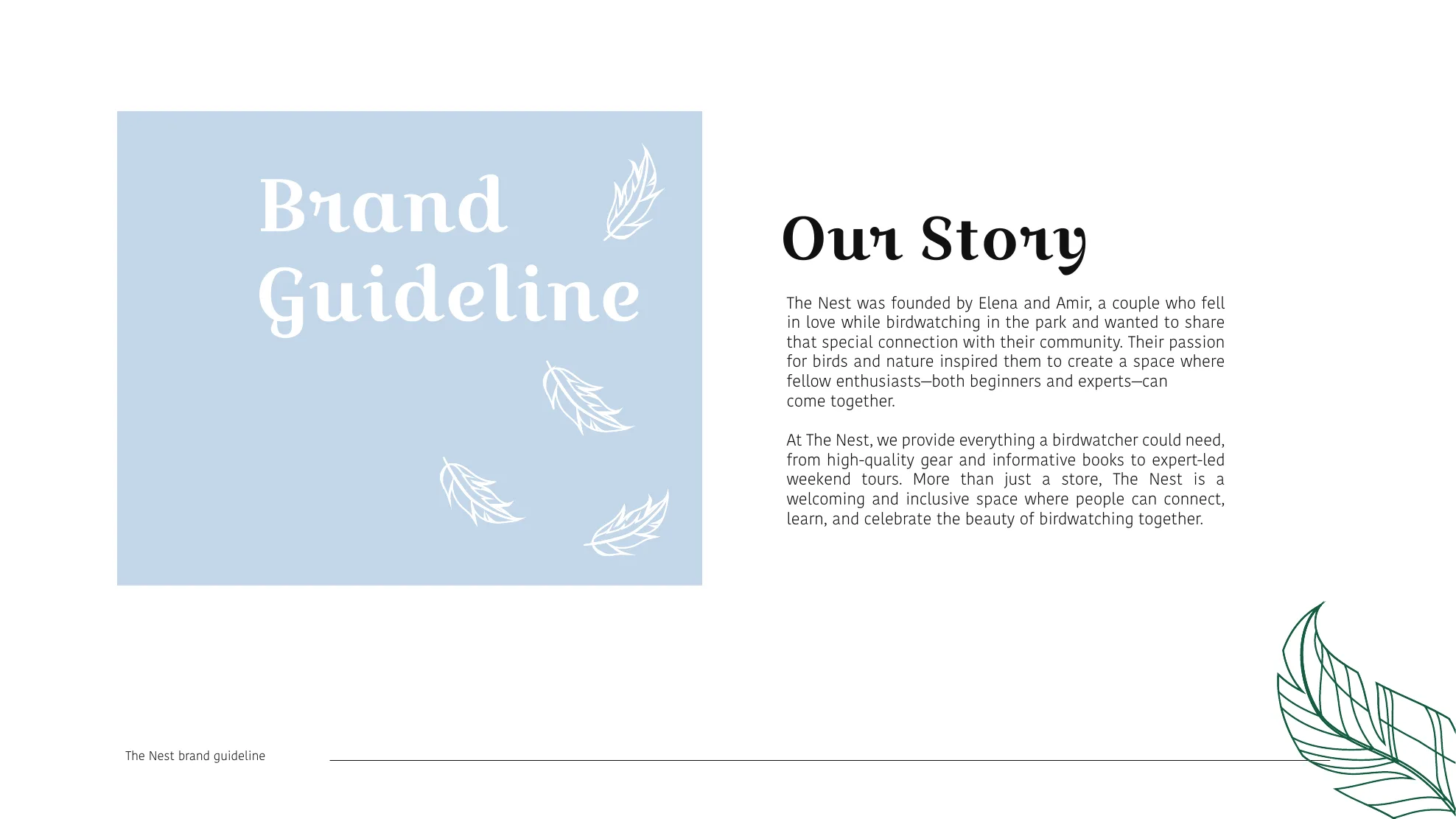
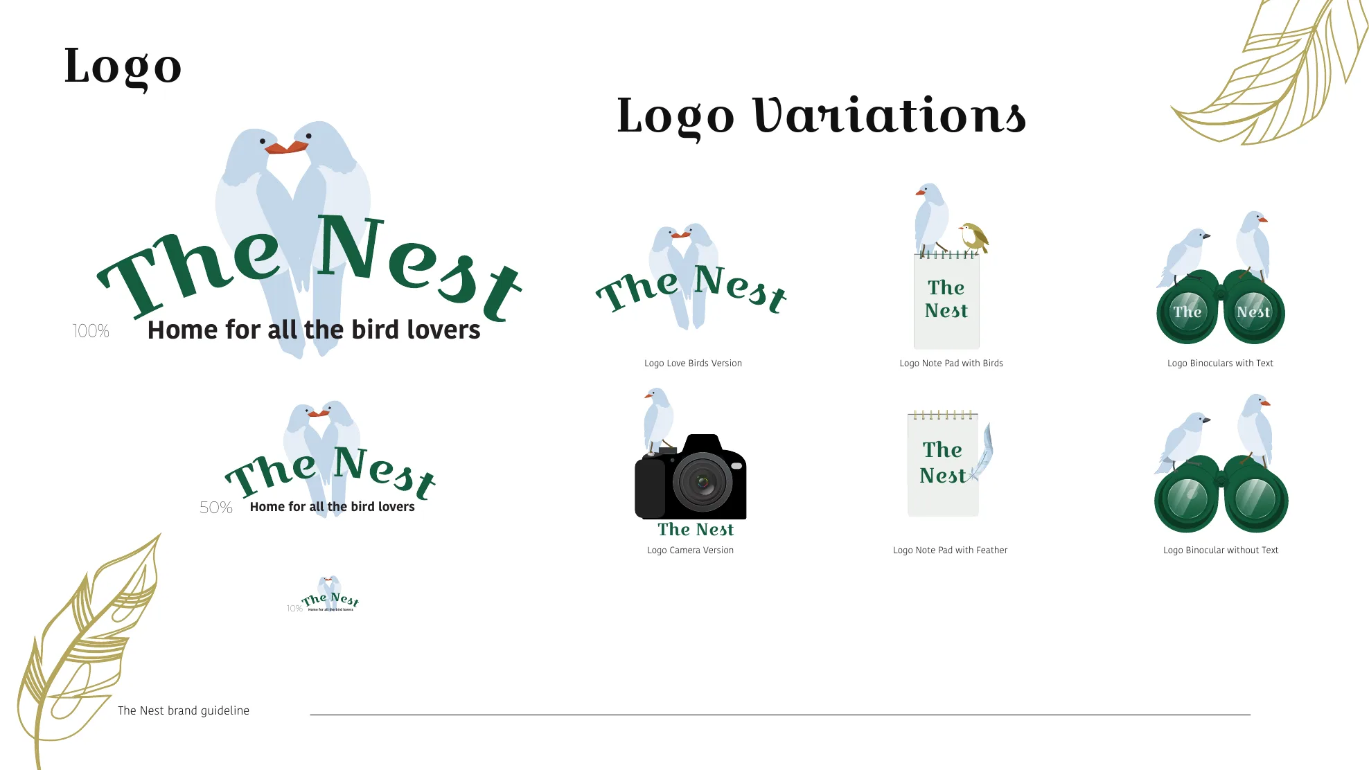
The shop was founded by a couple who fell in love while bird-watching, so the primary mark is two lovebirds perched on the wordmark. Alternate marks come from the gear itself (a field notepad, binoculars, a camera), and hand-drawn feathers in the brand colors carry the look across every piece.

The outcome

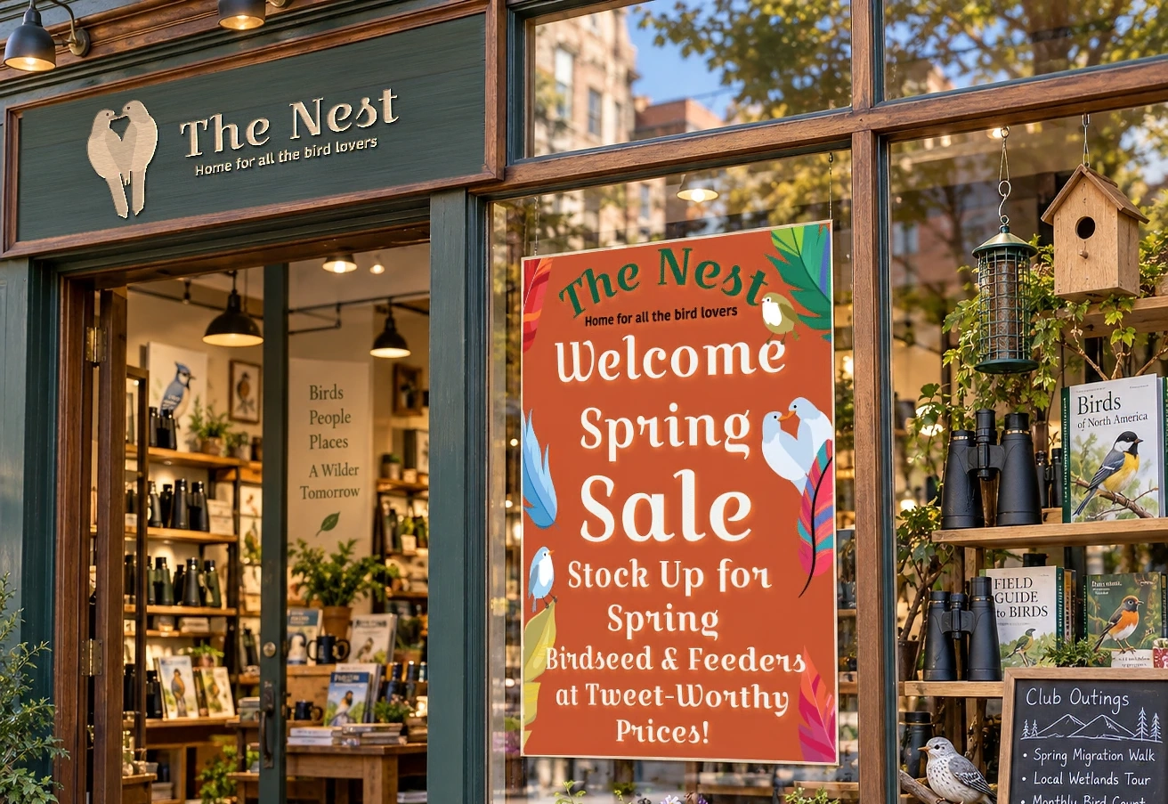
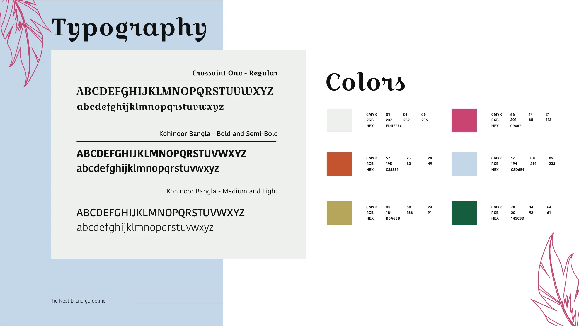
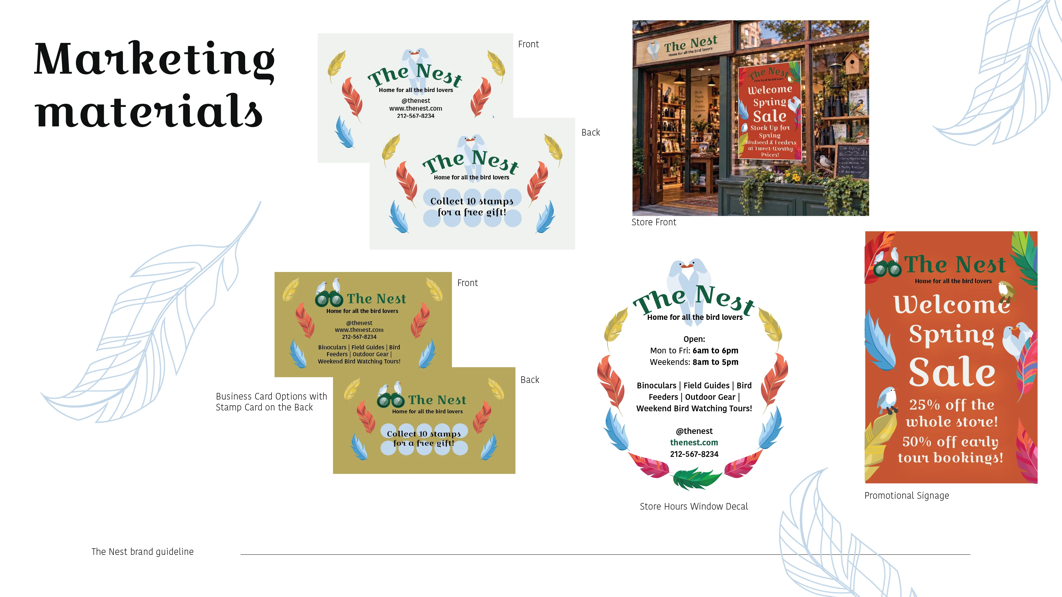
A four-page brand guideline covering the story, logo system, typography and color, applied to business cards with a stamp card on the back, storefront signage, a store-hours window decal and seasonal sale signage.

The Nest

Logo exploration

Directions built from bird-watching gear, each tested with the color palette, before landing on the lovebirds as the primary mark.

Field notepadField notepad
BinocularsBinoculars
CameraCamera
Primary markPrimary mark

The brand guidelines

Series image
Series image
Series image
Series image

Business & stamp cards

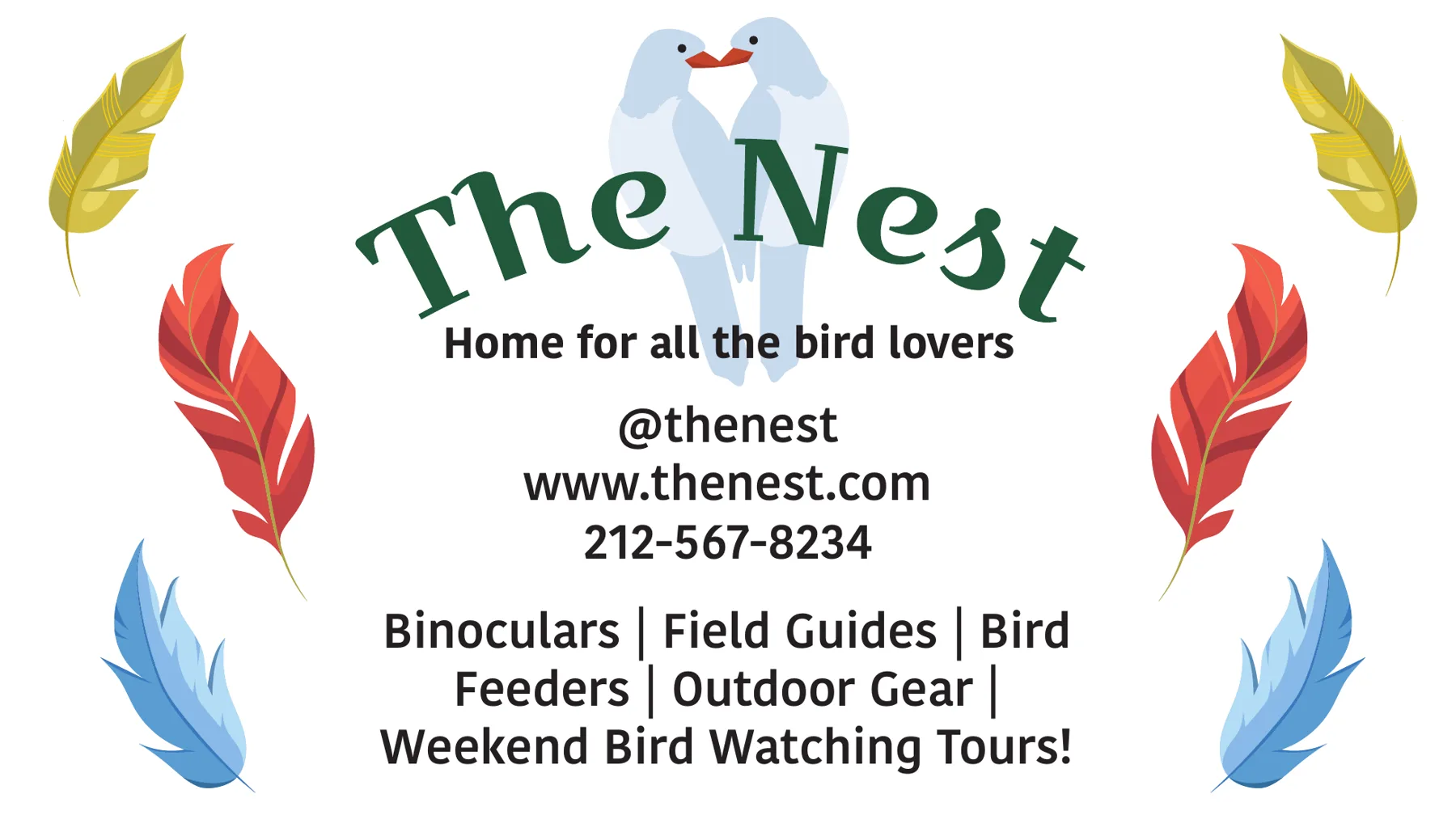
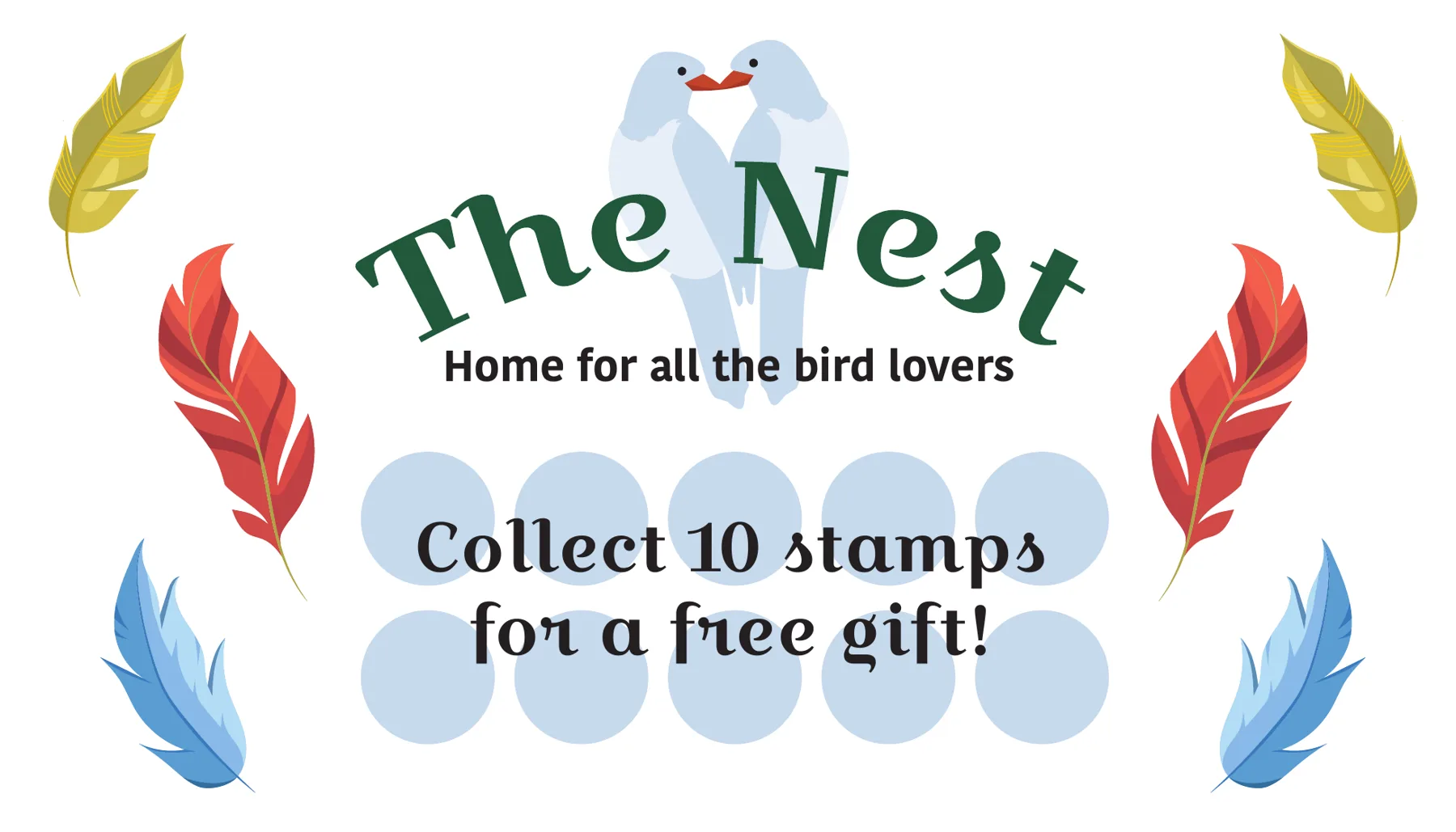
A business card with a stamp card on the back: collect 10 stamps for a free gift.

FrontFront
BackBack

In the store

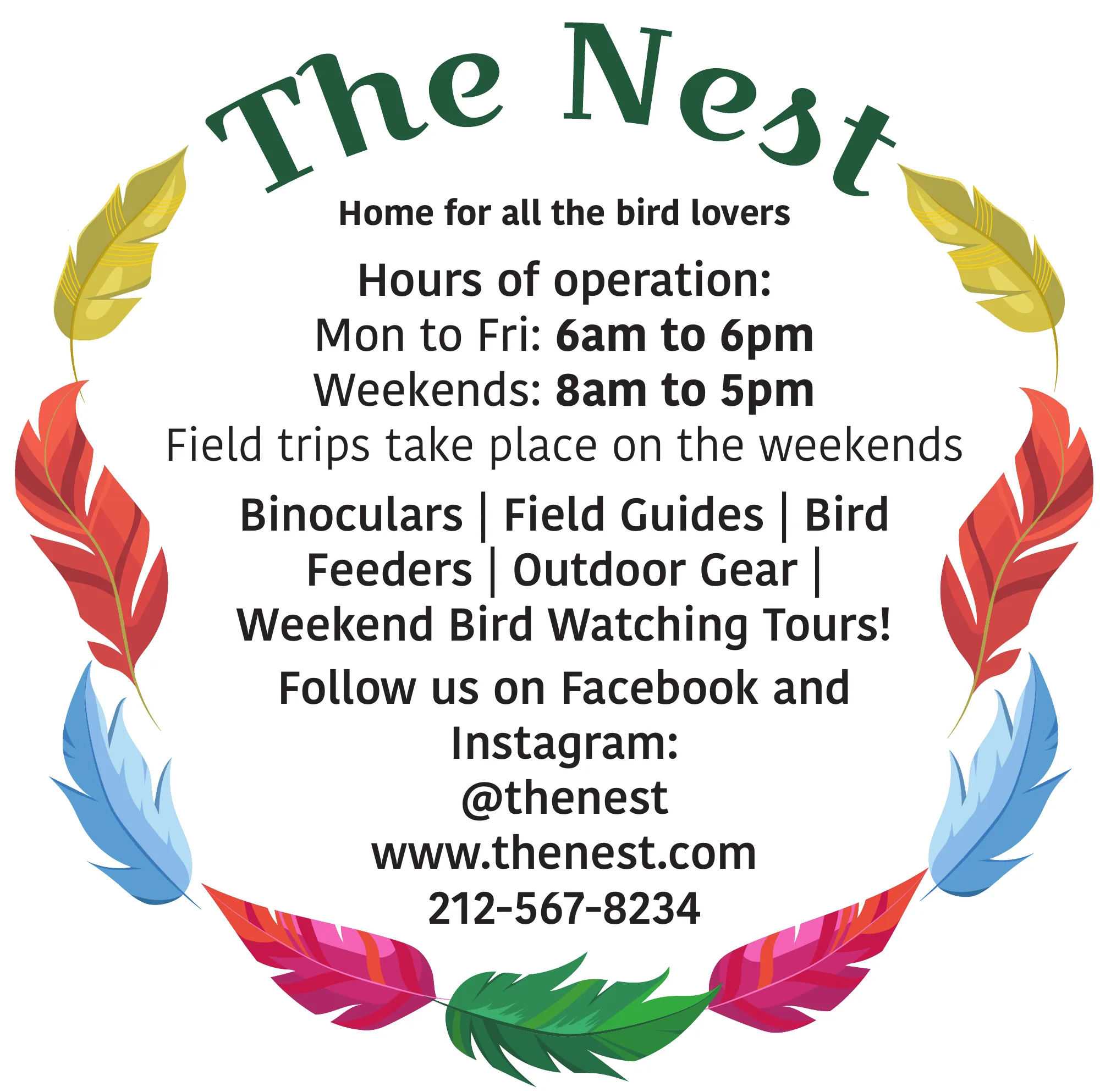
A store-hours window decal and seasonal sale sign, built from the same feathers, type and colors.

Series image
Series image
04
Concept magazine · Class project · 2025

The Monthly Music Scope

The brief

Design an original magazine from start to finish, then pitch it as a real business.

The idea

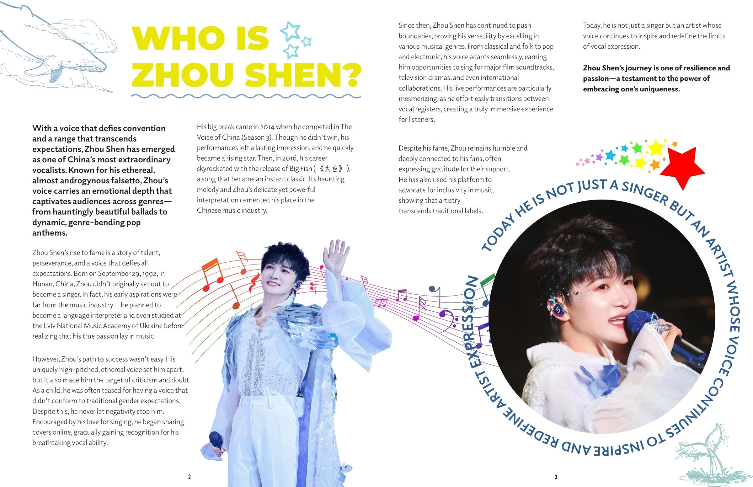
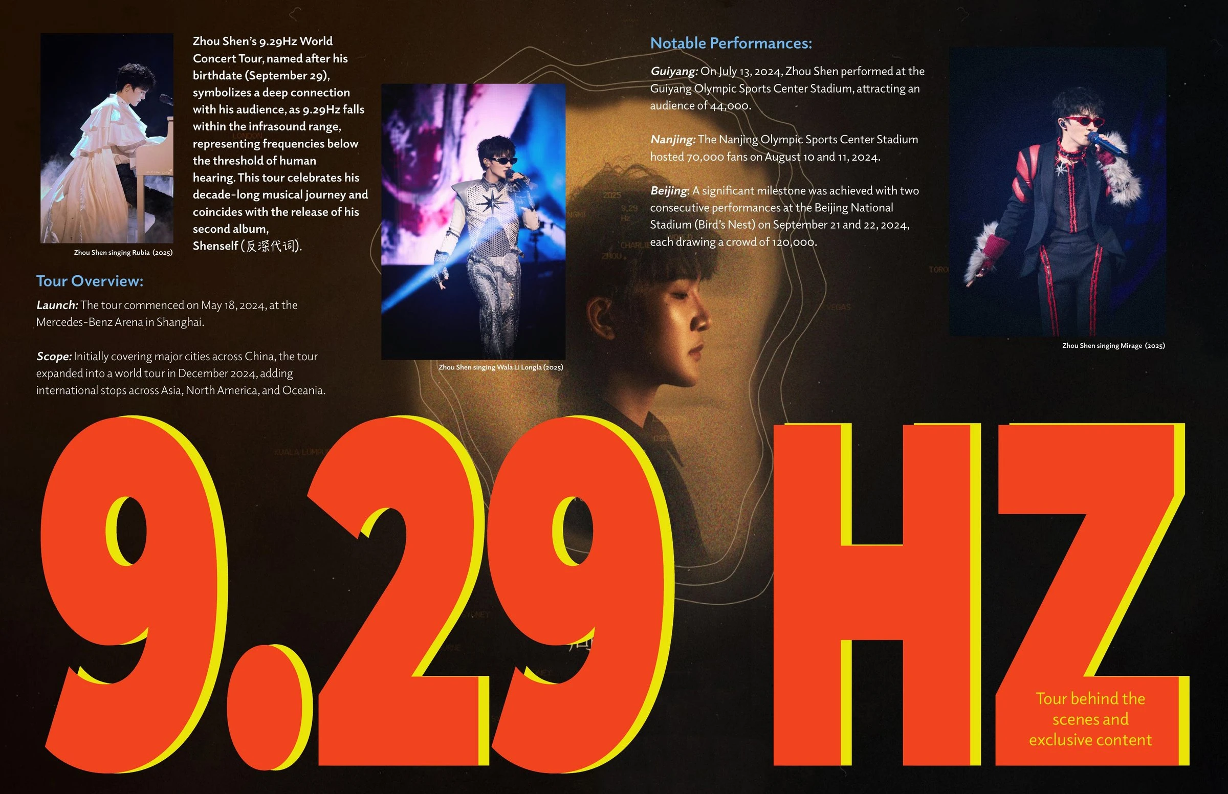
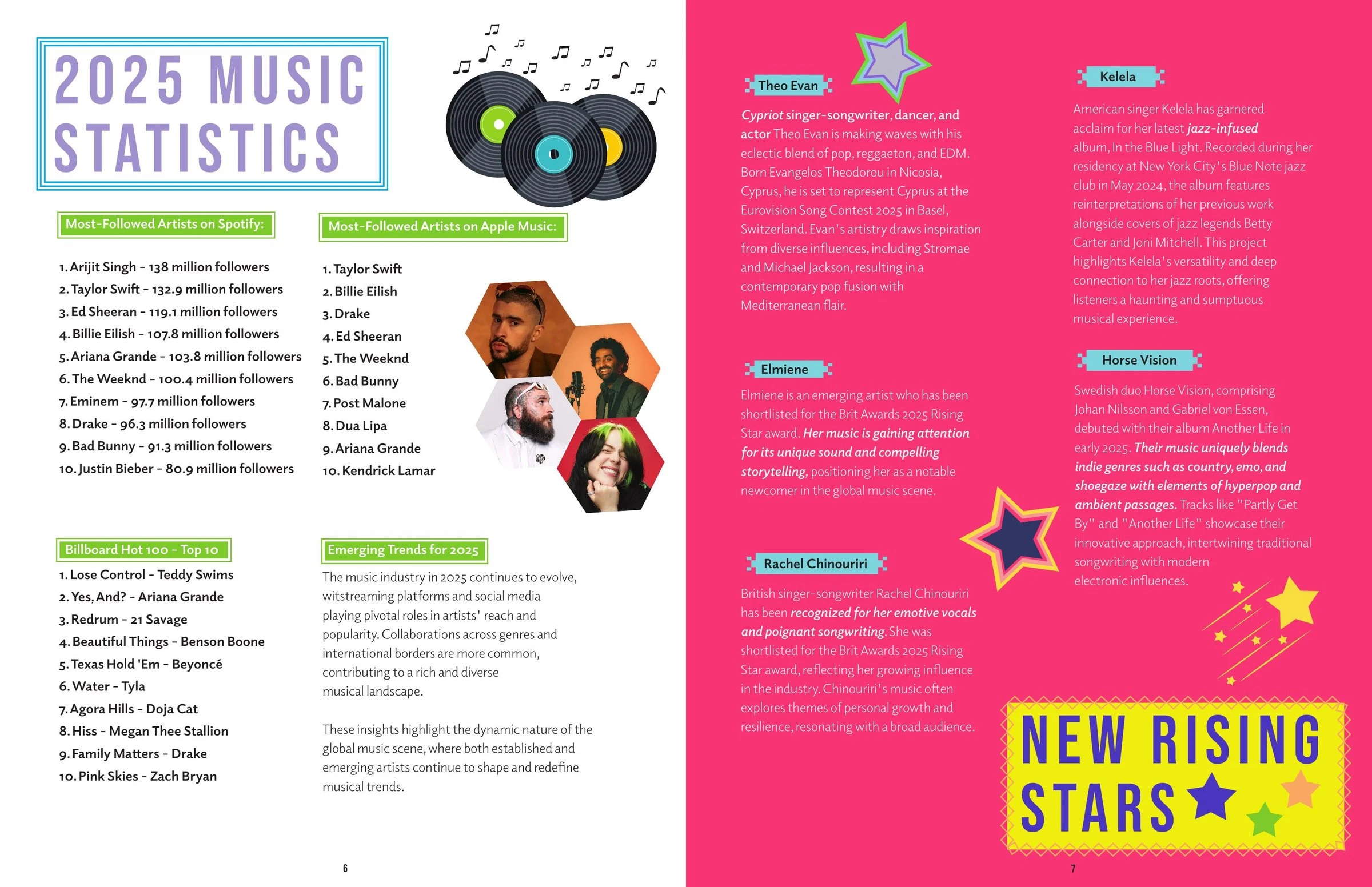
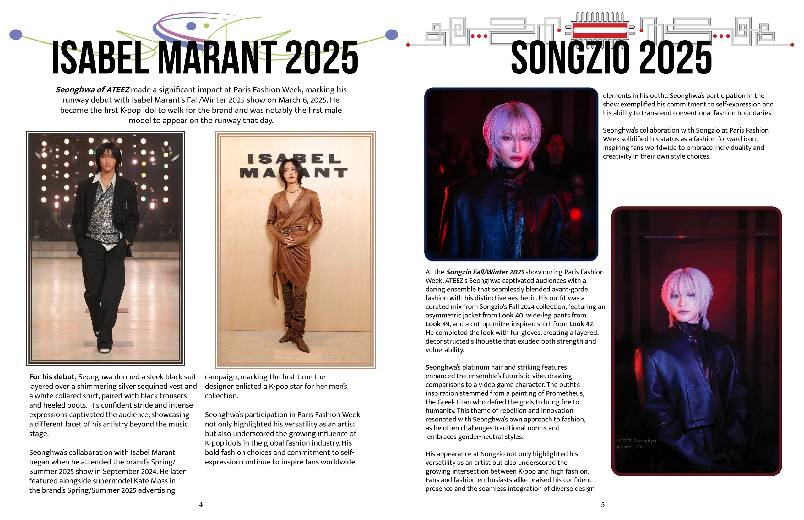
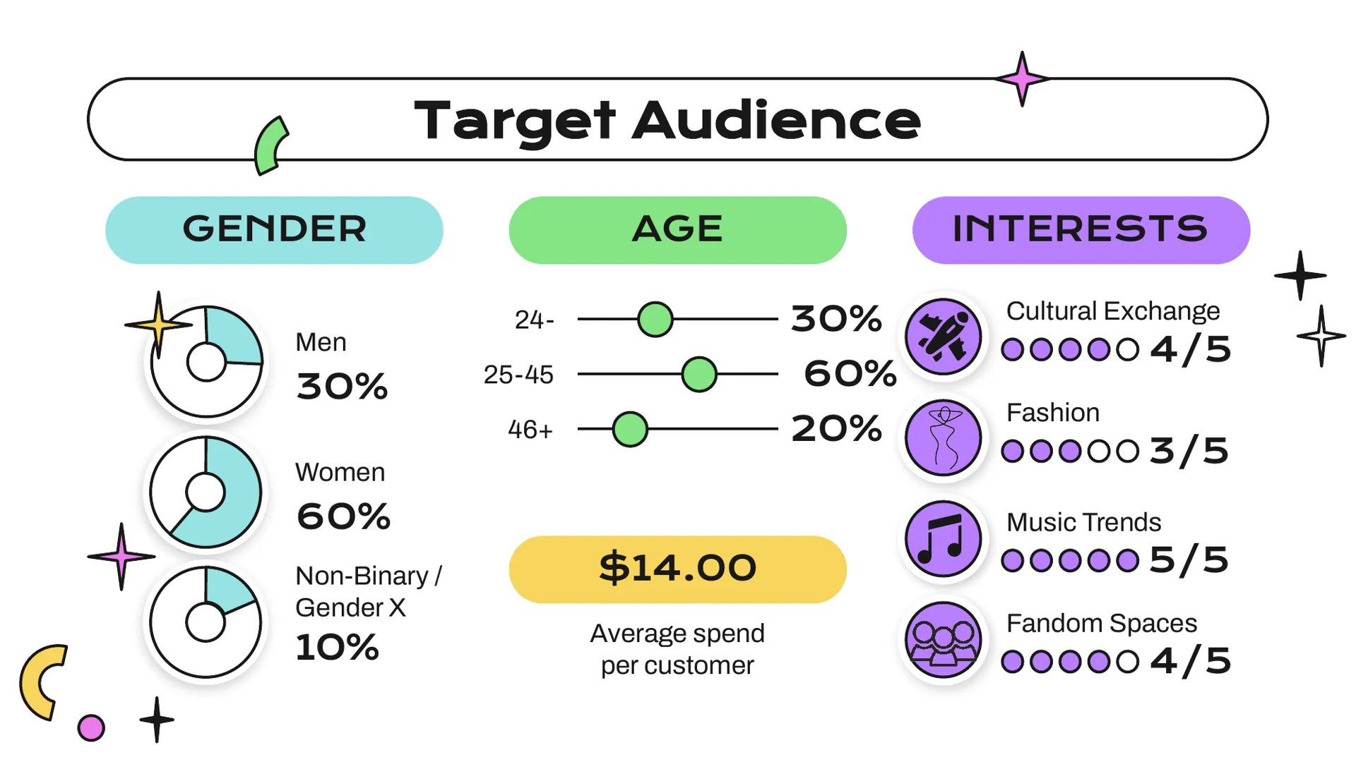
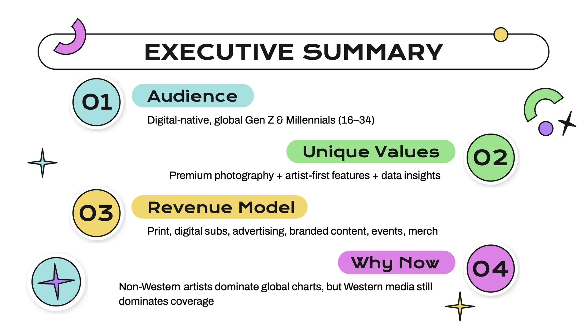
A global music magazine for Gen Z and Millennials (16–34) that spotlights artists from Asia, Europe, Africa, Latin America and the Middle East, pairing deep artist profiles with chart insights, fashion and cultural breakdowns. I designed two sample issues, on Zhou Shen and Park Seonghwa, as a bold, collectable print object.

The outcome

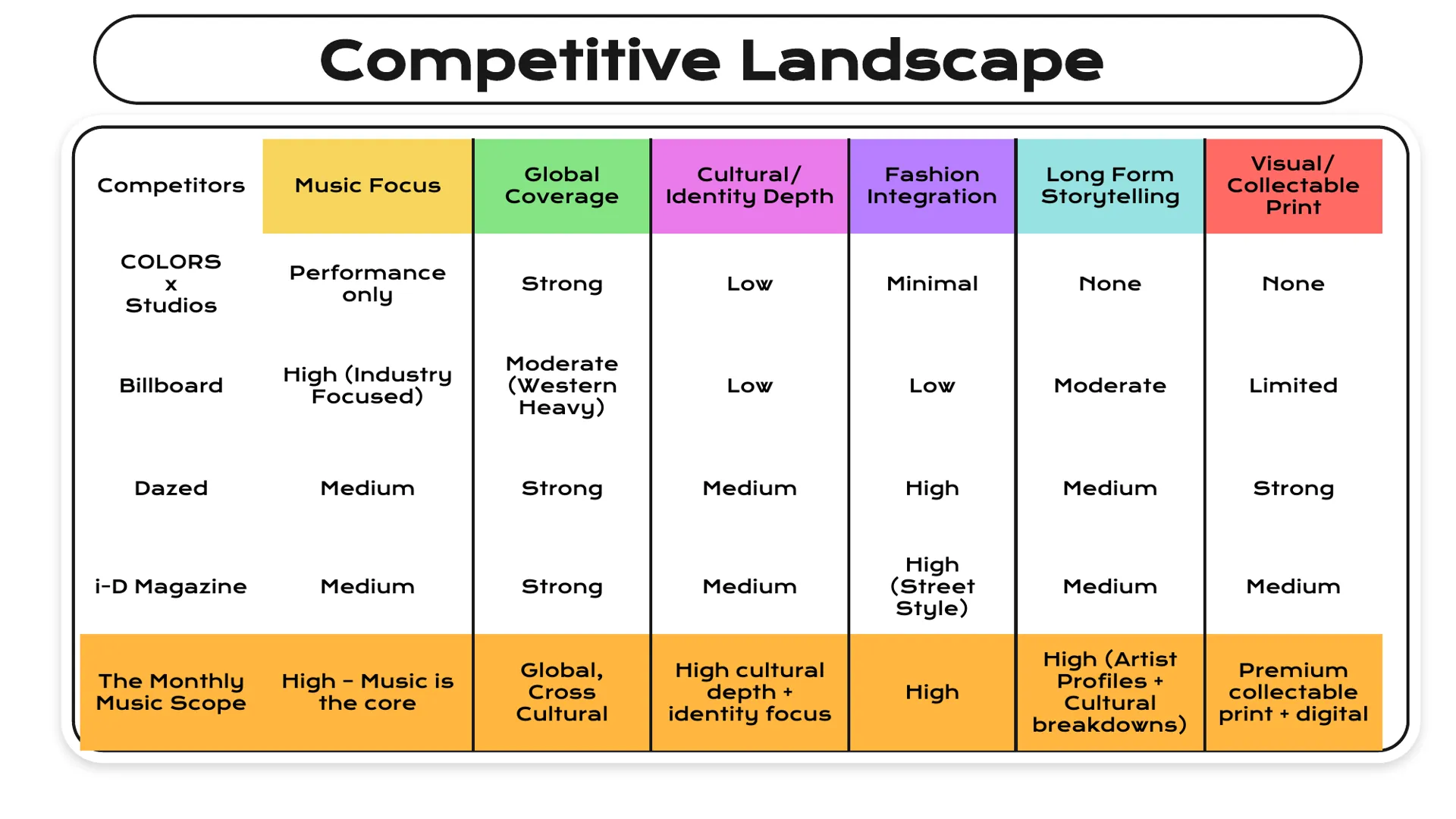
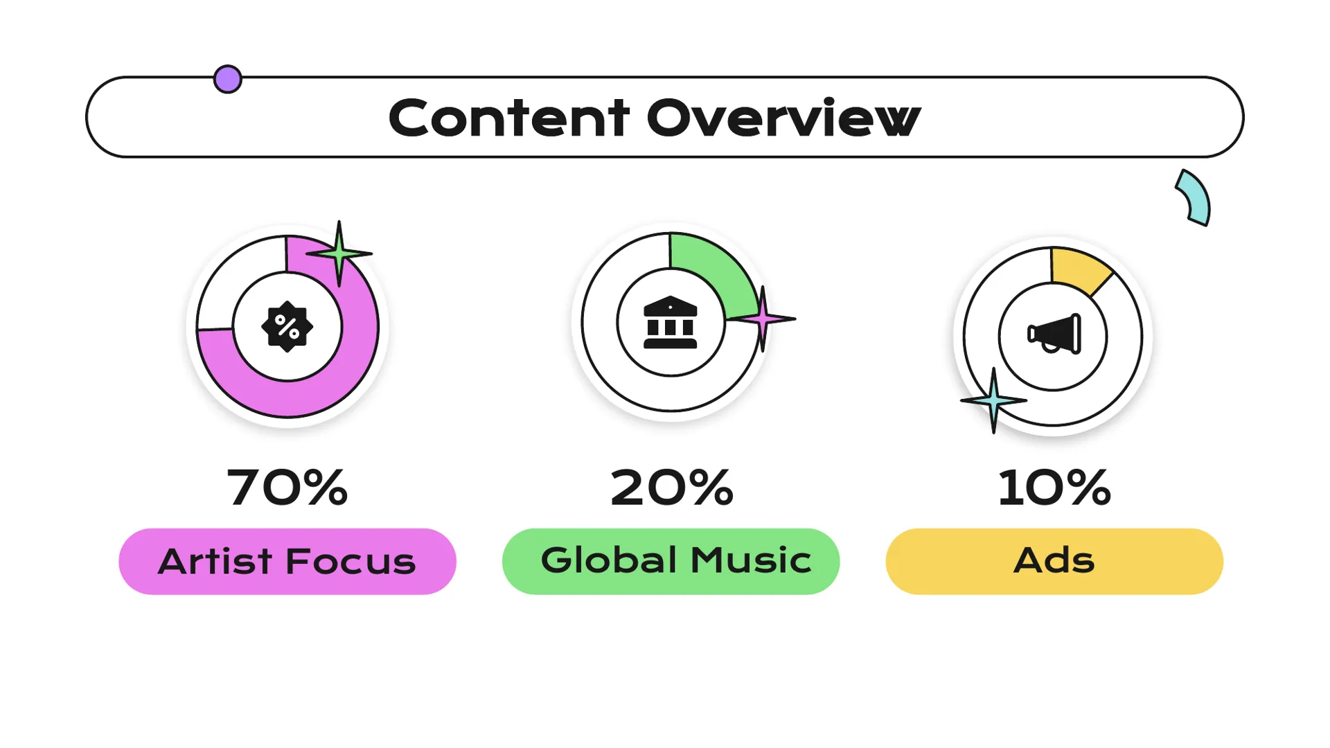
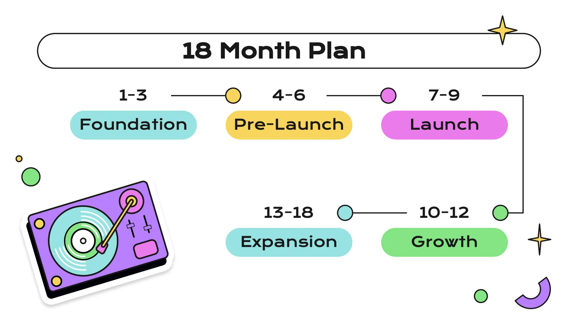
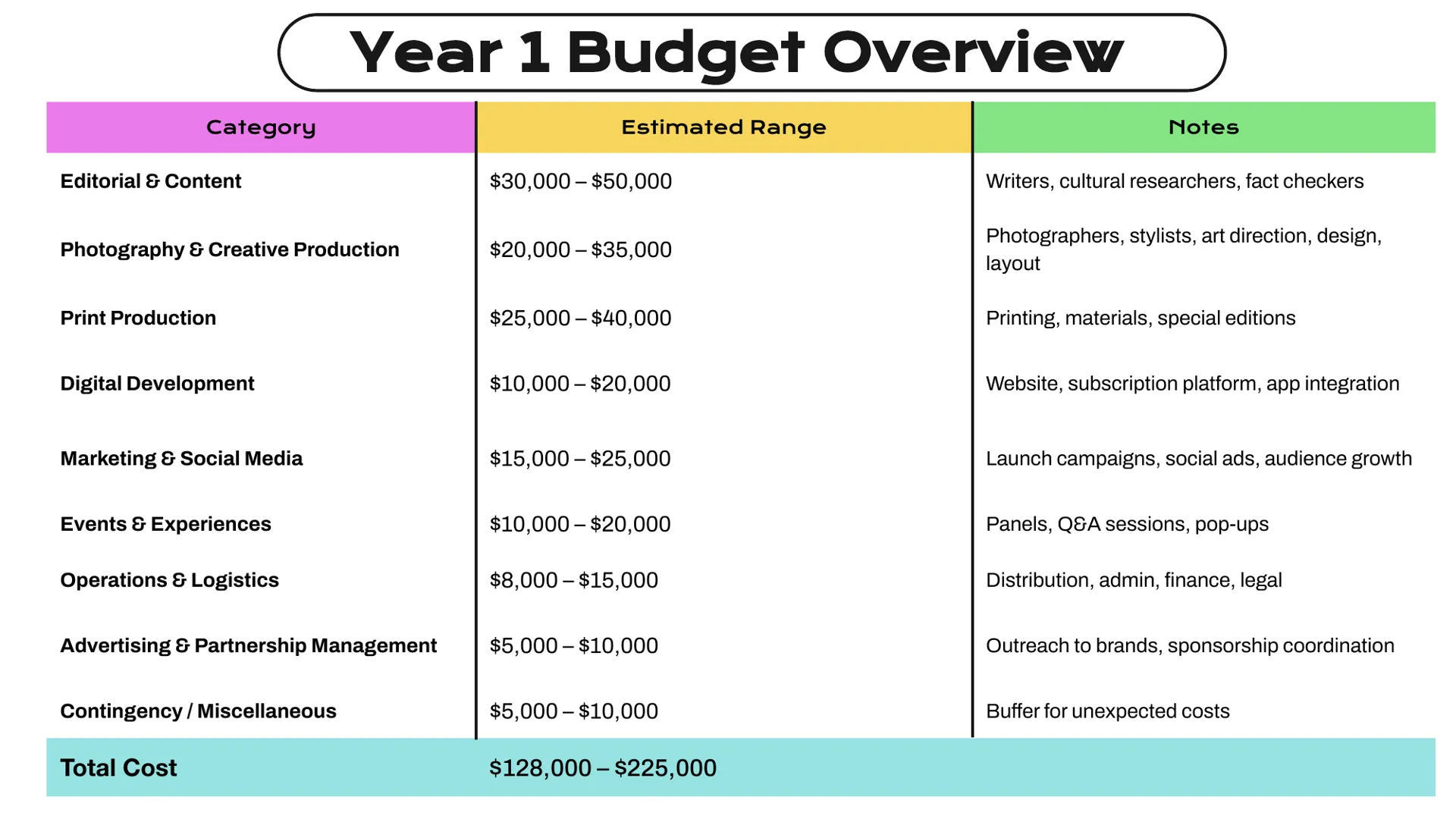
A complete pitch covering mission, market opportunity, competitive landscape, target audience, content mix, an 18-month launch plan and a Year 1 budget of $128K–$225K, presented alongside the designed sample issues.

The Monthly Music Scope

Sample issue #1 — Zhou Shen

Series image
Series image
Series image
Series image

Sample issue #2 — Park Seonghwa

Series image
Series image
Series image
Series image

The pitch deck

I built the business case as well as the look: who it is for, why now, how it makes money and what it costs to launch.

Series image
Series image
Series image
Series image
Series image
Series image